


First impressions
First impressions are very American. The homepage has three choices: 'Main shop', 'Entertainment' and 'Pic n' Mix'. The main shop has a distracting carousel and would benefit from some targeted products based on season, popularity or promotion line, as their main competitor Argos does. The overall look and feel is rather cheap, which does not match up with Shop Direct boss Mark Newton-Jones' statement that, "The site is about quality, value for money and great service".
Navigation
The navigation and search are generally pretty good especially the mega drop-down menus on the top, but the left navigation is a bit too much. Moving between shops is easy, unless you have something in a basket and you move to a new store, as they don't share a common e-commerce platform so you get an annoying message and have to buy before moving on. Not having a combined basket cuts down on impulse buying.
Buying
Shopping and buying are pretty easy, with a nice, simple to follow registration process for first time users. Choosing colours and sizes gets a bit more complicated as the flow of interaction is fairly unintuitive so you generally see lots of pop-up errors. Delivery options could be better displayed such as, leave behind shed, etc and from this point on the e-commerce platform, shared with Littlewoods, feels very cheap and off the shelf, ironic really given Mark's statement about quality.
Lowdown
This is a brave and bold effort to bring back to life a much loved, chaotic brand and in many ways it is not dissimilar from the past high street experience. You'll have to judge for yourself if that is a good or a bad thing. It's meant to be kid friendly, but most kids know more about online than most adults and they are far more scathing in their views, so a site aimed at kids could fall flat on it's face when it is judged by the hardest audience of all.
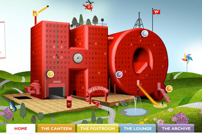
Check out the blog site, woolieshq.co.uk, this looks great and from a brand view seems to be much more interesting, engaging and polished. In the end this site has been designed and launched in super quick time, which seems to be the norm these days, and having worked on similarly tight deadlines I am very impressed.
.jpg)


.jpg)