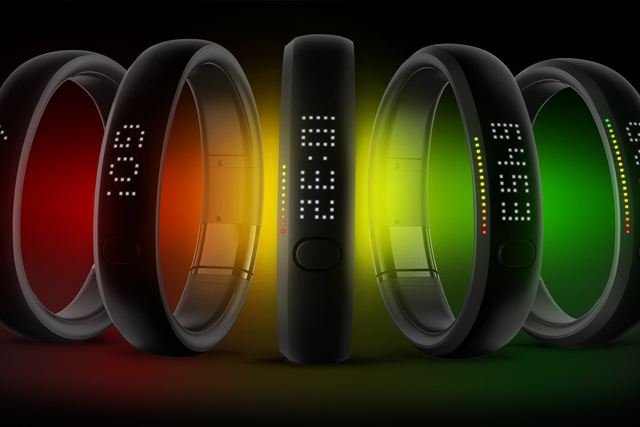
 I love it when I check out my Nike Fuelband activity scores over the last few weeks and I see all the shiny green bars laid out in a bar chart for me. One for every day. Each day similar to the one before.
Each week not that different from the one before that. Oh wait, this FitBit chart's more useful. There's a nice widget here showing that I climbed so many flights of stairs today that it would have taken me to the top of the Eiffel Tower! Had I been in
Everyone loves data these days. Whether it's Nike+ tracking your runs, your Withings scales tracking your weight, MyFitnessPal tracking what you eat, your Xbox tracking your l33t headshot skills, your likes and follows, your unsubscribes, conversions, sales.
Well, it's not really the data we love is it? It's the information we get from studying the data. We love the knowledge we get by absorbing that information.
Actually, it's the ability to make better decisions informed by that knowledge that makes it all worthwhile. Wisdom, you could call it. DIKW (commonly pronounced dick-oo) as this hierarchy is called in information science. Data-Information-Knowledge-Wisdom.
Wisdom end
Charts are supposed to help us understand data more easily, to get us closer to the wisdom end of things. They became popular in a time of leeches, steam power and impractical hats over 200 years ago.
Studies have revealed that with too much information to hand, people's decisions make less and less sense.
Not much has changed since then. Oh, apart from the sheer mind-numbing amount of data that exists to be charted. An estimated 90% of the world's data was generated over the last two years and it's growing exponentially.
Information fatigue is a recognised problem. It was even added to the Oxford English Dictionary a few years ago. fMRI studies in the
The anxiety caused by the deluge of information can be debilitating. Charts (like leeches) were intended to give us a bit of relief. However, they run the risk of sacrificing usefulness for style, much like an 18th Century hat.
Actionable insights
In order to make informed decisions we need actionable insights, not just facts. Human beings aren't rational. We don't make decisions based on facts. We are wobbly bags of chemicals and lizard brains, not pristine decision-making engines.
We need not only to see the correlation between sets of data in attractive charts but to be provided with clear recommendations. What does this chart mean to me? Now what do I do? Charts have an important role to play in supporting a recommendation or insight but they're not an end in itself.
The current trends in Wearable Computing, Personal Analytics and the Quantified Self are bringing us into closer and closer contact with the aura of data we generate as we go about the messy business of being alive.
Until these digital services move past the presentation of charts to something nearer usable "wisdom" we might be better off with virtual leeches.


