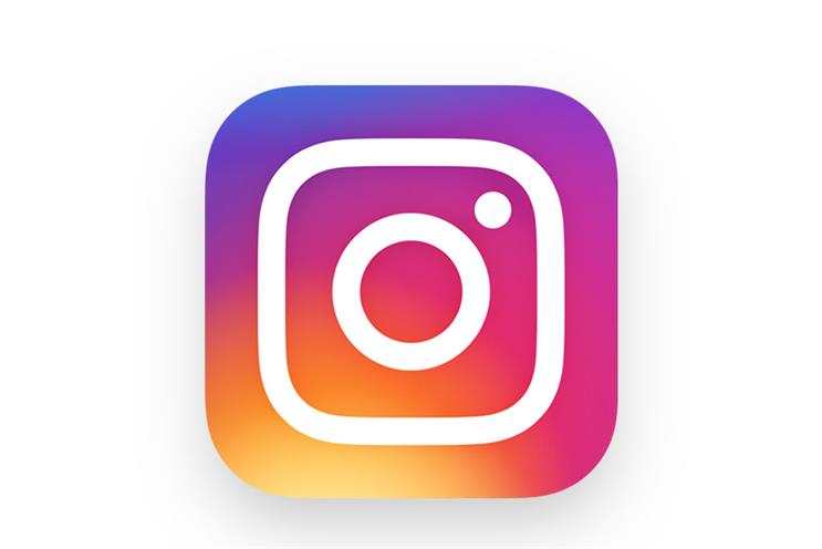
The platform has kept its iconic camera and rainbow colours but has used the rainbow as a gradient with a white outline of camera.
It is the latest major tech platform to rebrand its logo this year, following Uber and Gumtree.
In a blog, Instagram said that it wanted to "honour Instagram’s identity while reflecting its growth" and that the logo was no longer "reflecting the community".
It added: "Anecdotally, we knew that people loved the rainbow and the camera lens was a key visual element.
"As a part of our process we also asked people at the company to draw the Instagram logo from memory in five seconds. Almost all of them drew the rainbow, lens, and viewfinder.
"With this insight, we decided to translate these elements into a more modern app icon that strikes a balance between recognition and versatility."
The branding for Hyperlapse, Layout, and Boomerang has also been updated.
Instagram has also stripped back the app because it wants the user images and videos to make up the colour.
The blog said: "By paring down the new interactions and using standard iOS and Android components, fonts, and patterns, people will be navigating familiar terrain. We also redesigned our icons in a way that feels at home on Android and iOS."
Uber launched a new logo in February which replaced its familiar u-shaped design with an abstract geometric shape – prompting a mixed response on social media.
And in January Gumtree stripped back its tree logo as part of a major rebrand, designed by Koto, the agency behind Airbnb's redesign in 2014.

.jpg)
.jpeg)