


I have had the great good fortune of working with one of London's best planners, Lisa Lee. (We started an agency together, in fact, with Phil Keevill, now creative director at Kitcatt Nohr. When we went along to a client to take a brief, we did all the usual stuff: interrogate the product ... mine the data ... etc.
But before we left the meeting, we agreed with the client that we could ask them one question that might make them uncomfortable, even offend them.
We looked them in the eye and said "What's the hidden truth?" In other words, what is the thing you are NOT telling us that could have a massive impact on the work? It might be that despite all the flowery techno-speak in the brochure, the product is actually a dog. Or the Chairman's wife hates green - even though it's one of the corporate colours.
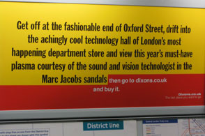
I was reminded of this process when I saw some ads for Dixons.co.uk on the Tube. It's part of the controversial direct response campaign that has .
Here is a campaign that has faced up to some home truths. Like ... nicey nice middle class people would not be seen dead in a bog standard high street electrical retailer. As for the alternative - shopping online - that is an experience so hideous it should be reclassified as a form of torture, the very opposite of retail therapy.
But ... there is a third way. Pop along to your favourite posh emporium, talk to a real human being about your needs and they will recommend the perfect product for you. Then go online to buy it.
Of course, people are already doing this. Folk of my daughter's generation find their goodies in real shops, and then Google their way to an online bargain. Dixons have not only recognised this consumer trait, they are encouraging it - to the benefit of their brand.
The ads themselves are a joy to read. The art direction is deceptively simple. And one or two niggles from me aside, the typography is perfect. Each execution alludes to, but does not name, a famous London store. Selfridges, for example. And if I am not mistaken, the art director has used each store's own typeface for the body copy. True wit.
Next time you're on the Tube, look out for the campaign. And perhaps look inside your own organisation for some of those hidden truths.
Simon Kershaw is a creative consultant and former executive creative director of TDA, and creative director at Craik Jones
_1.jpg)
.jpg)

