


I've never been to Wickes. I'm not even sure where my local Wickes is. If you told me that Wickes didn't exist, I wouldn't be able to prove that it did (without Googling it at least). Yet, if I ever needed a bit of three by four, (or is it five by six?), I know where I'd go - B&Q. Only joking. I'd go to Wickes.
The reason I'd go to Wickes is that it would give me an air of spurious competence. Whereas, if I went to B&Q, I would be admitting I know next to nothing about DIY. The fact that this would be an accurate admission is not the point.
Once armed with a hammer, paintbrush or map, there is only one direction for a bloke, and that is to maintain the ludicrous illusion that we know what we're doing. We have no choice. That's why we won't ask for directions or read an instruction manual. I hate to be genderist, but things like that are not manly.
Ever since this campaign began, and it feels like 300 years ago, it's held me in its thrall. In part it's to do with the Timothy Spall voiceover, which is authentic, while also being a complete pastiche of itself - even my nine-year-old daughter can send it up.
Another core ingredient is the red pencil. I'm not sure there are many carpenters, plumbers or sparkies that use pencils. My house is crawling with tradesmen at the moment, and they all seem to use horrible biros.
Even if they did use pencils, I'm not sure they'd be the chunky beauties you see in Wickes ads. The Wickes red pencil isn't real; it's whittled from the stuff of legend. Sorry to go on, but what I also love about the whole red pencil device is the remarkably modest and apparently arbitrary amounts of money saved when it hoves into view, 14p there, 9p somewhere else. Sometimes a giddy 26p. This is true husbandry of resources. None of your half price, bogof, or interest-free.
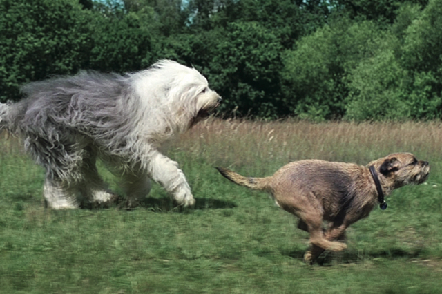
If I was allowed a grumble, it's that the red pencil doesn't appear in this ad. If I was to grumble further, there's a slightly gratuitous visual metaphor involving a sheepdog and a border terrier, rather than a close-up of some decking or the satisfying junction of tongue and groove.
Despite these slips, this is a great bit of communication design. It also includes one of the most cumbersome product names ever to appear in a TV ad, 'Wickes trade vinyl matt brilliant white emulsion'. I'm never quite sure what an emulsion is, but if I ever need one in brilliant white, that's also matt and vinyly, this is the one I'll get. It might as well have my name on it.
Brand strategy verdict: 10 out of 10
Not the best in the campaign, but still a durable performer that I'm sure will sell bucketloads of trade vinyl matt brilliant white emulsion. I'd have given it 11 out of 10 if it had featured some architrave marked down by a deftly hewn red pencil.