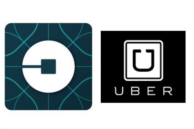
Its previous logo comprised a white square with a stylised 'U' in the middle.
The . A British passenger, for example, will see a blue logo with a circular shape, while a Chinese customer will see a red marque.
The idea is to make Uber appeal to a broader audience, which is tricky when the concept of cars-on-demand is fundamentally centred on luxury.
Uber says its visual overhaul expresses two components at the heart of its brand. One is 'bits', or technology innovation. The other is 'atoms', or the brand's impact on human lives and transportation.
The brand refresh also acknowledges Uber's expansion beyond car hire and into new services like food delivery service UberEats, or on-demand delivery UberRush.
As is often the way with a rebrand, punters expressed their immediate outrage on social media. But at a deeper level, does the new logo and concept work?
Yes
Ryan Hall, managing director at Nice and managing partner at Karmarama, describes the new look as more "populist".
"The brand now certainly looks less premium, moving toward the more mainstream ground that Uber aspires to reach," he says. "This refresh positions Uber as grounded, populist, and inspiring but also warm and approachable."
Hall also believes the 'bits and atoms' concept is a neat encapsulation of where Uber is heading as a brand.
He adds: "These concepts combined, represent Uber's simultaneous commitment to technology and human-centricity."
He concludes: "I think it will define the brand in future, as long as Uber addresses one significant challenge – ensuring that its human ethos is a key part of the digital products and user experience that it provides."
No
Jim Prior, chief executive of The Partners, Lambie-Nairn and The B to D Partnership, argues that the rebrand is more spin than substance.
Having seen the updated logo on his phone, he says: "I don’t like it. Where once I had a semiotic connection to a luxury brand (which is what a quasi-private car service is), now I have a sort of techy thing (which is what an app is, not a car service)."
Prior, who was travelling in the US at the time of writing, notes that a coloured logo not only fades into his smartphone's background, but, confusingly, will change colour on his return to the UK.
"Surely one beauty of Uber is that it’s the same everywhere you go in the world?" he contends. "Of course, I’ll get used to it immediately and, as far as I can see, there’s very little change to the UI once I click in, so maybe it doesn’t matter too much whether I like it or not.
"But this does seem to me to be a case of the company changing identity because it wants to tell itself a new story, rather than because it wants to tell their passengers something of value to them."
Why Uber's telling a story
Uber undoubtedly does want "to tell itself a new story". When Marketing visited Uber's offices last year, the firm had hired US President Barack Obama's former campaign strategist, David Plouffe, .
At the time, Uber's CEO, Travis Kalanick, said: "As an engineer, it’s often about you making stuff and letting the work speak for itself.
"But if you grow like we’ve grown, you’re like a black box, you’re not telling your story and people fill that box with whatever gets clicks."
He continued: "You need to learn how to tell your story."


.jpg)
.jpeg)
