


BBC Sport has a new identity.
 A bespoke typeface named after the corporation’s founder and designed for ease of reading on digital platforms, Reith (right) – with its "contemporary proportions" and "spartan elegance" – will be rolled out in stages across The BBC in lieu of the decades-old fonts currently in use.
This is the latest in a series of big brands that are starting to understand how a unique typeface has the power to communicate so much about them.
Major players like YouTube, Apple, Google, eBay and PayPal have all jumped on board, with typefaces created from scratch, offering them a bespoke brand expression.
Master type designer Bruno Maag compared a good typeface to a well-crafted suit, noting that "it always looks perfect". I’m inclined to agree.
When it comes to creating a compelling brand with substance, designing a bespoke typeface is something we love to do. It makes the end product so much tighter. Yet brand owners are often surprised when we start talking about it, asking: "If you can have an off-the-shelf font, why would you invest in a bespoke one?"
Here’s the thing. There’s a lot more to typefaces than meets the eye, and you certainly need to think beyond Helvetica and Gotham.
There’s a whole level of psychology attached to the decision process. The use of serif is subliminally associated with traditional brands; sans serif is regarded as more contemporary, and a display face can really catch your eye.
You can communicate so much about the personality of your brand simply from a typeface.
Off the shelf
There’s a vast wardrobe of existing typefaces available and a good branding designer will quickly identify the right one to capture a brand’s character.
 Just look at Virgin and Spotify (right). Both have harnessed their personalities with Circular, a good, solid, geometric sans serif that oozes friendliness, with just a touch of seriousness. It works for both of them.
With so many options ready and waiting, selecting an existing typeface can be helpful when working to a very tight deadline. There are libraries of styles ready to use straight away, whilst a bespoke typeface can take from a few weeks to a year (or even longer) to complete.
Going bespoke
For some larger companies, cost can be the driving force in the selection process: it may be more economical to commission an original typeface for a fixed fee than pay to use an existing one given the scale of their internal and digital audiences.
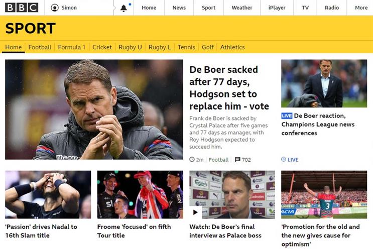
For others, such as the BBC, it’s about making sure their text is clear and legible across platforms.
BBC Reith is the product of a shift in how audiences consume the channel’s programmes, with a uniform approach needed across both TV and digital platforms.
The resulting typeface – working in harmony with the recognisable BBC Sport yellow for now, before it is rolled out across the BBC portfolio – is designed to be more legible on the smaller digital screens through which the channel’s content is now widely accessed.
Brands are made up of lots of components; they are machines and every part needs to pull in the same direction.
Everything that your audience sees should evoke the brand’s personality, from the colours used and the logo to the tone of voice and the typeface. A bespoke typeface can really capture a brand’s unique character.
It can also just make life easier. You can brand things without plastering the logo everywhere. You can whisper instead of shout and still be heard.

I first became aware of brands harnessing the power of bespoke typography when Rudd Studio collaborated with Fontsmith about 15 years ago to create a show-stopper for Channel 4.
It cleaned up at the design awards and really led the way. It helped Channel 4 cement its unique cultural position with a note-perfect typeface that struck just the right balance of weirdness with sharp Swiss design principles.
Channel 4 has done it again with new cutting-edge typefaces (right) created by type legends Neville Brody and Luke Prowse, released last year. I think these two examples really showcase the benefit of a sharply cut typeface that beautifully expresses the brand at every touchpoint.
If the font fits…
For a typeface to be fit for purpose there are myriad considerations, from functional to emotional. Does it need to work on a specific type of screen at small sizes, such as Bookerly, which Dalton Maag created for Amazon Kindle? Or grab people’s attention, like the Channel 4 display typefaces?
To get the typography right for a brand, we need to be clear on its identity, its personality, its values, what it stands for and how it wants to be perceived.
That can then be captured, designed and crafted into a bespoke font that expresses a unique aesthetic that works across the board, from big billboards to tiny details.
Luke Woodhouse is creative director at Ragged Edge