


Andy Fowler
Executive creative director, Brothers and Sisters
I’ve just spent all weekend in the agency working on a pitch. I’m hallucinating with tiredness, so these words come with a disclaimer. I may be unhinged. I may be evil. I may be just plain wrong.
My heart sank a little when I saw the word Tesco (4), but this is quite good. There’s a sweet insight in what couples do to woo each other around food. I can imagine it being a rich vein of stories. I’m struggling a little to believe Geordie boy ate curry for 15 years, when he actually hates it. Flipping heck. Does he run straight to the loo after dinner every night? Does he store the curry in his cheeks like Brando in The Godfather? Does he secretly feed the dog under the table?
Watching the Specsavers (3) ad, I feel like I’m watching a weak pastiche of great Stella Artois ads from the 1990s. The Jonathan Glazer era. A dying man requests a pint of the expensive stuff. On his death bed. Conspiratorial monks fall through the ice. Those stories had twists and turns and looked incredible. This just feels a bit groansome. Like someone has studied the ad history textbook and said: "I fancy a bit of that." I’m sorry – it just feels like treading very old ground. Rather than taking suave, subtitled French storytelling somewhere it hasn’t been before.
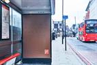
You’ve got to admire Maltesers (5) for bravely going where no brand has gone before. And I don’t mean a bus-stop near the Bro and Sis Batcave in Farringdon. A Braille bus shelter that reads "Caught a fast bus once – turns out it was a fire engine" is a funny idea. And conjures a great cinematic image in my mind. I wonder how many blind people have actually read the poster. Is it really for ad folk and trade press or something that is genuinely meant to surprise and delight blind folk? It would be lovely if it was the latter. I imagine it’s probably the former.
Kellogg’s Corn Flakes (2) seems to be trying to convince me of its versatility. I buy porridge being a flexible breakfast bowl. You can add yoghurt, honey, seeds, nuts. Same with granola. You can spruce it up. But Corn Flakes? Do I buy the idea that this old-school staple of the British breakfast has been reinvented as the mix ’n’ match, DIY choice of the imaginative breakfast customisers? Not sure. But this is Chaka’s gig. And I like Chaka. So I’m going to go with it. In fact, once I’ve slept off this deep fatigue, I’m going to wake up refreshed and experiment with various Corn Flakes toppings. I’ll report back on Twitter: @azzafozza.
And, finally, BUPA (1). I like the simplicity and purity of the thinking. Proper discipline. Like the Chelsea back four. Good choice of music. Great performance from the hero woman. I really feel her emotion flowing out. There may be a missing ingredient that could have elevated this spot. I think perhaps the line about owning the dance floor is a bit too on the nose. But nice job. Martin de Thurah is an ace director, no doubt about it. Will he ever top that Under Armour swimming ad with Michael Phelps? I hope so.

Mike Nicholson
Executive creative director, Brave
We open on… a drumming gorilla… thousands of bouncy balls cascading through San Francisco… the man your man could smell like… ode to a pea… the crazy ones… "Real men of genius"… Ray Gardner… Martians laughing at a raw potato… a cog.
Great creatives know you need to start with something never seen before. This way, you’ll catch the eye, intrigue the mind and make memorable, original work. Work that stops people skipping and starts them sharing. Putting the brand front of mind at the point of purchase and increasing sales by the drone-load.
For Tesco (4), we open on a drab city and the title "David’s ‘hot or not’ chicken curry". I’m curious enough to see how the dish might lift a grey January day. What plays out is an endearingly written love story that sadly looks like any other target-market-mirroring-ad-featuring-middle-class-folk-using-generic-products-in-suburbia. So my interest wanes and I only continue watching as a duty to Private View. On discovering it’s for Tesco, which is still thankfully backing one of the best campaign lines ever, I feel let down. Surely this ad should have focused on a modern-day "little help" that makes me want to go to Tesco instead of the competition?
Specsavers (3) opens on a plumber’s van arriving at a chateau in Provence. The plumber thinks he has mended the dodgy heating by draining the pipes before we discover he has actually drained vats of fine wine instead and should have gone to Specsavers. It’s brilliantly shot, cast and written. Another great execution of this classic campaign.
Back to opening on a target-market-mirroring-ad-featuring-middle-class-folk-using-generic-products-in-suburbia for Kellogg’s Corn Flakes (2). Worse still, it’s testimonials this time using the well-worn "How do you eat yours?" strategy. I am sure bright minds worked on this campaign and hope brave ones do next time.
BUPA (1) opens on a lady who owns the dance floor again thanks to the cancer care she has received. It draws you in and is charmingly understated and moving thanks to a nuanced performance and some confident direction. My only niggle is: why Bupa? This could be for the NHS. Like with the Tesco ad, I’m missing a reason to buy.
Finally, a Maltesers (5) poster that catches the eye and intrigues the mind. As a PR idea, it works for me. As a poster, I’m not so sure. Blind folk will struggle to find it and, even if they do, isn’t the Braille too big for them to get? For those who do find and understand it, surely the pack shot needs to be in Braille too for them to know what it’s for? Those who can see won’t get it either, unless they have very big hands and understand Braille. For me, it does a great job at representing disability in advertising but struggles as a piece of communication.
Take a look at what you’re working on. Is it a banana selling a car? Or has it been done before?