


Richard Brim, chief creative officer, Adam & Eve/DDB So I’m sitting in the Palais on the first night of the Lions awards in Cannes in June. And I am there to pick up a couple of the little roaring beauts for a piece of work our agency produced for Skittles. As the other winners are announced, I have a varying range of reactions – as one does – while sniffing the bums of the competition. From "Da fuq?" to "That’s nice" to "No shit! ‘Fearless Girl’ won 97 Golds … and so it should." And then I saw "Pass the Heinz".
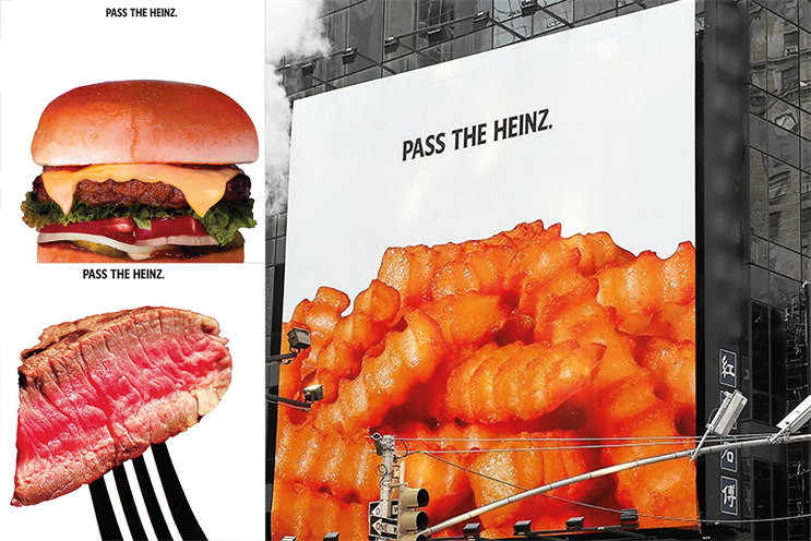
At first, I thought: what’s all the fuss about? The art direction is old-fashioned and the line feels outdated. And then, at last, I twigged, and a huge surge of jealousy raged through my body. For those of you who don’t know the idea, to prove the timelessness and love that people have for its Ketchup, Heinz decided to run the series of posters that a certain Mr Don Draper and Co presented to that brand 50 years earlier – in season six of Mad Men. Ugh, it makes me sick – mainly because it was such a gift, handed on a Mad Men-shaped platter with a side order of Lucky Strikes and a tumbler of Scotch at three in the afternoon.
Why no one else – including me – had thought to do it is beyond me, which makes this campaign even more annoying. Running the exact executions, nothing was changed one little bit – not even the stock and quality of the photography, which was (to audience members in the know) slightly gimmicky.
But then there was the wonderful co-credit, shared by David Miami and Stirling Cooper Draper Pryce. It was just right. Wonderfully right, in fact. And as relevant now as then, because things are better with ketchup.
This is OOH at its best: brave and fun and smart and timeless and simple. While the smartarses in Miami plan what’s next, I’m off to smoke myself hoarse, down a bottle of single malt and be inappropriate.

Louise Sloper, head of art, BMB London Choosing one piece of OOH from this year’s winners wasn’t easy. There was a wealth of exciting, boundary-pushing work, and it was all very, very different. I have to mention "Fearless Girl" and "Game of Thrones" briefly, though. They broke the rules of how we traditionally view OOH, were exquisitely crafted and had overwhelmingly positive impacts within the world around them.
"Orgasm Sound Library", "AirInk", "Dog Channel" and "The Refugee Nation" also displayed original and broad solutions to using OOH as part of a campaign – showing that whether it’s traditional or not, the medium can still be one of the most powerful.
But I’ve chosen a campaign that I can get deep down and sexy with in terms of art direction, and super-nerdy with in terms of a campaign asset system that’s just so frekking straightforward: Twitter’s "Hashtags". Simplicity at its best. #theperfectposter. Pared back to the absolute necessities, allowing room for the storytelling. A design not overwhelmed by logos or cluttered by never-ending statements. A campaign brave enough to know the brand’s power and believe that less is more. A brand savvy enough to trust in the public’s intelligence to fill in the gaps.
The juxtaposition of "traditional" OOH with a tech brand is an intelligent, if unexpected, choice, but one that gives the work impact. It’s clever. With its bold imagery, a raw style is created that fits any subject. The art direction can move at speed, just as Twitter’s streams do, with a look that feels like a news bulletin – a visual concept that the viewer can relate to, hitting that mystical "authentic" note, showing real debates about real subjects that people care about. It has a strong aesthetic with a punch that demands attention, subconsciously engaging the viewer to consider each story.
It’s a poster design that can be understood at a glance without relying on dwell-time, with the hashtag being championed as the contemporary symbolism that it is; a shorthand for a much bigger meaning, reclaimed – back to its original home. A deserving Grand Prix.
OUT OF HOME: MORE RELEVANT THAN EVER
Glen Wilson, managing director, Posterscope UK
Out of home has impact. As another landmark year in Cannes proved, a well put-together OOH campaign reaches people in unforgettable ways that other media struggle to match. It is a creative canvas that can deliver long-lived brand fame.
• It’s flexible The best OOH creative is adaptable and ingenious, tapping into popular culture and becoming culture itself.It provokes thought. Ogilvy France nailed this in 2013 with its Grand Prix-winning ‘People for Smarter Cities’, transforming billboards into street furniture for IBM.
• It’s inspirational OOH was the most popular category at the 2016 Lions, attracting 5,367 entries – a clear demonstration of the draw it still holds for creatives. Nothing else shows the big idea with quite the same punch. This was exemplified by Colenso BBDO Auckland’s ‘Brewtroleum’ for DB Export, winner of the Outdoor Lion
Grand Prix that year.
• It’s fearless OOH is fearless by nature and sometimes by name. The 2017 Grand Prix winner ‘Fearless Girl’ from McCann New York offered a truly outstanding execution crossing boundaries and bringing surprise, awe and excitement.