


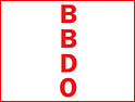
The new logo employs a vertical format and dual colour scheme to reinforce the prominence of the BBDO brand name, while retaining the local identity of each BBDO network agency as is the case in the UK with Abbott Mead Vickers BBDO.
The revamp comes on the heel's of Peter Walker quitting as the finance chief of BBDO's European network last week after less than a year in the job, saying that the job "isn't what I had expected".
The former chief operating officer for Europe, the Middle East and Africa at Leo Burnett was appointed as BBDO Europe's chief financial officer in January. But his autonomy is understood to have been severely restricted by the tight financial controls imposed by BBDO headquarters in New York.
The new logo will be introduced in September in the US, but will not be introduced in Europe and the UK until January. The new design replaces the existing BBDO logo, which has remained essentially unchanged for the past 100 years.
Allen Rosenshine, chairman and CEO of BBDO Worldwide, said: "As a creative communications leader, we felt the current BBDO logo was a bit staid and stale -- particularly since our brand has become arguably the industry creative standard bearer over the past 20 years. The new design was created to reflect our position as a growing, leading creative communications company and to set us apart from our competition."
The new corporate identity has been in development for more than a year and was created by Nolin Branding & Design, part of the BBDO network. It was overseen and endorsed by the creative committee of the BBDO Worldwide board and agreed by the BBDO Worldwide board of directors.
US agencies are expected to begin phasing in the new corporate identity immediately. It will be fully implemented throughout the network by August 2003.
If you have an opinion on this or any other issue raised on Brand Republic, join the debate in the .