


Many British clubs have had badges (not brands) that have remained largely the same for a hundred years or more; and this heritage is arguably one of the factors that draws so many people from across the globe to this country’s football culture. But the Premier League has just launched its third identity in 25 years, as it faces a future without a corporate title sponsor.
Although different from the outgoing identity, the new logo in particular is similar enough for us to view the update as an evolution, rather than a revolution.
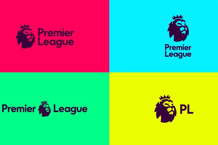
Perhaps most notably, contrary to early rumours of felinicide, the equity of the lion has been retained to uphold the heritage of the brand, but also updated and simplified.

The new logo features only the lion’s head, rounded (not unlike a football…) and forward-facing.
This simpler logo will no doubt allow for more flexibility across platforms and lends itself with roaring success to digital icons and buttons in particular.

The logo will of course be used on television across the globe; but for most UK football fans, the Premier League logo is most commonly sighted on the sleeve of their favourite players.
Here, too, the head will be more striking and more easily visible from a distance. By being more compact, the lion can be used in its entirety on sleeves, television and so on, giving the brand maximum, consistent exposure as it goes it alone without a title sponsor.
There’s scope for misuse
The new identity also does away with the navy blue and white that has represented the Premier League since its inception in 1992, and has since been described as too "corporate".
In its place, the new identity boasts a range of vibrant colours. This modern palette is designed to reflect a more diverse, "human" and progressive side of the league; but along with the abstract patterns that relate back to the lion’s mane, there is real scope for misuse and the brand toolkit will have to be closely managed.
Also, in an industry where colours are critical, having an identity that uses multiple colours may actually make things more difficult when the brand wants to straddle the entire league.
One of the outgoing identity's most visible assets is the bespoke font that provides the look of the number and name on each shirt, unifying them all and making each player immediately recognisable as a Premier League footballer.
Indeed, one could argue that having names such as Beckham, Rooney, Aguero and Kane written in the font furthers the notion that the players are Premier League "products" themselves.
The current font has a hint of tradition, with its lightly flared serifs - it will be interesting to see whether the new word marque will provide the new font for players’ names. While the new brand and font looks modern today, I have to ask whether it will tire when written on every player’s shirt for the next five years.
Hashtag-friendly design
Returning to the present, the main reasons for the rebrand ultimately come down to flexibility and appeal. Flexibility is vital to the success of this identity, and this latest visual identity has no less than four different lock-ups. As ever, how these will be used across the many different markets will be key to how well the new visual identity is received.
One of these lock-ups explicitly names the Premier League "PL"; most likely a ploy to enable easier hashtagging on social media, and to speak to US-based fans, who regularly call the Premier League "BPL".
The simpler logo will also lend itself more easily to a range of different sponsorship deals, and will look more streamlined when placed next to Nike, EA Sports, and the other official sponsors, soon to be announced.
In general, this evolution of the League’s visual identity is a mirror of the endless and progressive march of the Premier League and its position as the world’s leading sports "product".
It’s a solution that’s refreshingly non-macho, non-corporate and ready to flex across multiple platforms and countries, broadening its appeal across the globe. The new identity retains some heritage, yet demonstrates the restless and ambitious nature of the Premier League as it looks to its future.