


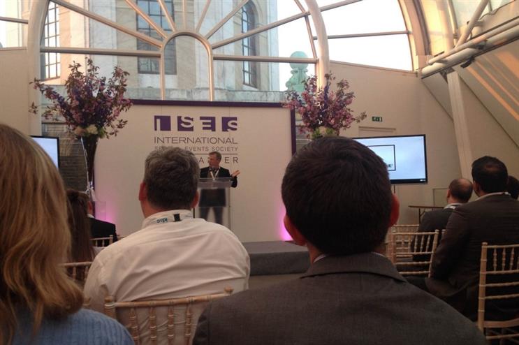
During his talk, named The Colour of Money, Dunsmore posed the question: "Why does business choose colour, and does it work?" If the results of his study are anything to go by, the answer is overwhelmingly yes.
According to Dunsmore, of the top 100 FTSE brands analysed, 30% opt for the colour blue across their marketing materials, meanwhile 25% use red and 24% have black branding.
He encouraged the audience to consider the colours of brands such as Facebook, Coca-Cola and Adidas. The majority of the population can recall their brand colours in an instant, and they happen to be blue, red and black.
Interestingly, Dunsmore noted that younger companies are choosing anything but these colours. He said: "The rules are changing but it doesn’t mean we can’t use them."
Particular colours prove popular among different industries. Of the 18 brands analysed in the financial services sector, 52.5% have blue branding, meanwhile 28% opt for the colour red.
Blue is again the preferred colour among media technology companies, where 30.9% have chosen to use the colour in their branding, followed by black at 23.5% and red at 16.2%.
"Black means expensive," said Dunsmore. It makes sense then, that of the 12 luxury fashion brands analysed, 54% have black branding, meanwhile 20.5% opt for red, and another 20.5% choose blue branding.
Colour associations
Dunsmore explained that different colours each have a unique set of associations. Red is high energy, attention grabbing and a good call to action. "It is always used with youth products," he explained.
Blue is universally liked and signifies success, meanwhile black means power and luxury.
He said the colour green is associated with authenticity and spring and is popular among leisure-related products, particularly as we enter into the warmer months.
"Purple has been avoided like the plague," Dunsmore said. He noted that big brands, such as Cadbury, have employed the colour successfully, and that it carries meanings of creativity and imagination.
Pink carries associations of energy, romance and femininity, meanwhile the colour orange signifies ooptimism and cheerfulness.
The colour white is generally avoided by brands, however Dunsmore acknowledged one particular company Apple – has been brave enough to use it.
"The colour was used so infrequently it was very carefully adopted by a tech brand."
More:
Comment below to let us know what you think.
For more in-depth and print-only features, showcases and interviews with world-leading brands, don't miss the next issue of Event magazine by .