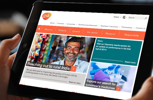
The pharmaceuticals giant has revamped its UK, US and global sites, and handed a new design framework, produced with Radley Yeldar, to its international outlets to give a more consistent view of its brand.
It has also tweaked its logo to place visual emphasis on the abbreviated GSK name, believing that GlaxoSmithKline was too hard for non-English speakers to pronounce.
Speaking to Marketing, GSK’s global digital director, Simon Quayle, said: "What was really important was being clear not just with customers, but employees, about who GSK are and what we do."
The changes follow a turbulent year for GSK, whose portfolio includes consumer healthcare brands such as Sensodyne, Aquafresh and Panadol.
Last September, the company , with chief strategy officer David Refern saying the company would concentrate on its consumer healthcare business.
But the company also wants to move away from the idea that it just "sells white pills", instead looking to highlight its medical innovations and research. Quayle said the new sites would pave the way for more positive stories, such as the company’s commitment to producing the first malaria vaccine.
He said: "The [new framework] gave us more of a platform to go out there and talk about our commitments to global healthcare and diseases in the developing world.
"It’s big ticket stuff that people can understand, such as committing to selling a malaria vaccine – all those things that show us in a better light than if you think of us as a company that sells white pills in western markets."
Quayle said that GSK had strengthened its "visual identity" and made its sites more mobile friendly. He added that the company had seen an opportunity after its London 2012 anti-doping campaign to tell people "who we are and what we do".
GSK joins fellow FMCG firms Procter & Gamble and Unilever in tightening up its brand focus. Unilever sold its Slim-Fast drinks brand to Kainos Capital in July, with an eye to focusing on its more profitable brands, while .

.jpg)
.jpeg)