


of
I didn’t go to ad school. My dad is a market trader from Leicester, not an agency founder from Putney. But before you get the violins out, I think I’ve done okay. I've been lucky enough to have met some generous, talented people who gave me their valuable time and their invaluable advice.
One executive creative director gave me all of his D&AD Annuals. "Read one a week, you won’t need to go to college," he said. So I did. I started with 1963. I read through, year by year, decade by decade. By 1976 I could recognise a great headline. By the mid ‘80s I was in love with John Webster and by the ‘90s I was scared of Tony Kaye but wanted to work at HHCL & Partners.
Through these pages I’ve witnessed the rise, fall and rise of TV, I’ve seen the birth of Apple, the demise of ambient, the influx of the Swedes, the Australians and the Latin Americans.
I’ve seen storytelling come and go. Music, design, humour, all fall in and out of fashion.
It’s fascinating. But it’s not just the work; the design of the Annual itself can define the spirit of the advertising age.
Good ones stand alone as a barometer to how the industry was feeling at the time and the role our industry played in culture.
The swagger of the ‘60s and ‘70s with the Peter Blake and Allen Jones covers.
Nothing embodies the inflated egos, salaries and self-importance of advertising in the ‘80s than that blow up cover of 1983 [below].

My favourite ever was in ’97, the year Mother got their hands on the design [below]. That was the year advertising finally learned to take the piss out of itself.

Then Brody choosing a New Blood grad to design his book was another turning point for me. A subtle "fuck you" to the design establishment.
I lent last year’s Sandoz "Manual" to a placement team and never got it back but I guess that was the point.
The point I’m trying to make, without sounding like one of those old cocks that talk about the good old days, is for me, the Annual is more than a beautifully curated collection of Pencil winners.
The great ones defy the brief and define the era.
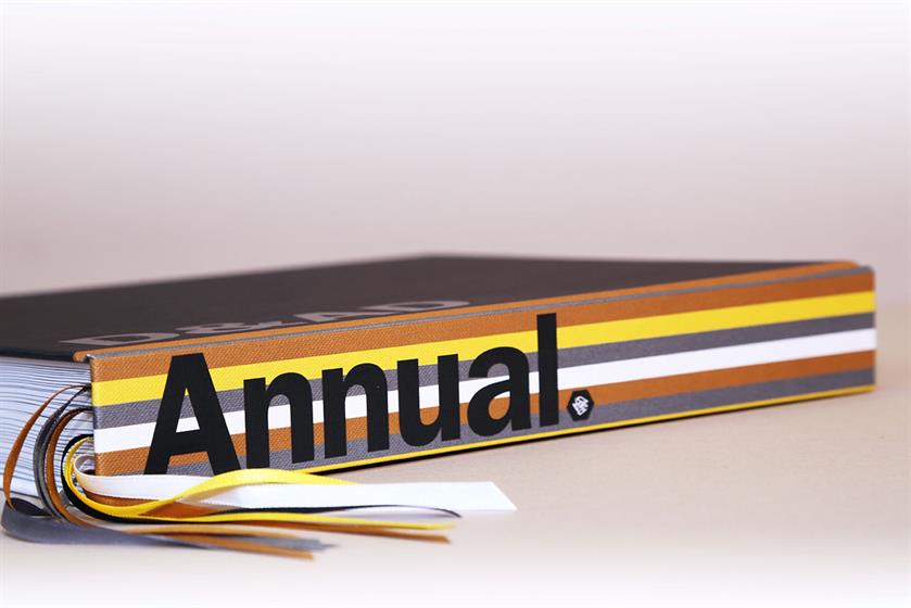
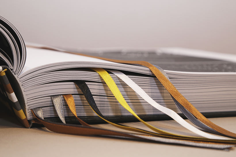
The 2017 D&AD Annual is beautifully designed. Proper design that is easy to navigate with coloured ribbons and stuff, and it uses the iconic ampersand to play with the elements that work needs to get in the book. Design and art direction. Magic and mischief. You get the idea.
It’s a designers’ Annual. Those who love matte black on black design will wet themselves over the cover.
But, for me it doesn’t come near to capturing the crazy times we’re living and working in.
I know that wasn’t the brief. But this industry, and arguably the world, is a little fucked at the moment. Yet the work coming out is as beautiful as it is bonkers.
Take the first few pages: if the world ends tomorrow, 2017 will be remembered for two blokes dressed as gonads and a bloke in a wheelchair singing "Yes I can". Kind of makes me proud we do what we do.
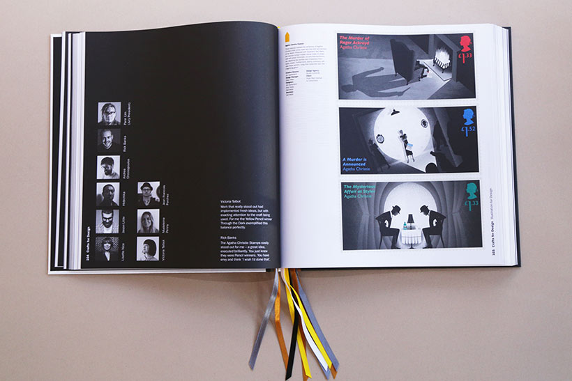
The 2017 Annual is thoughtfully designed. It doesn’t get in the way of the work it is celebrating.
I get it. Honestly, I do, I just miss the swagger of 2017. Page defining it is. But, age defining?
Let’s see.
Vicki Maguire is the co-chief creative officer of Grey London.