


The electrical retailer, which is part of DSG International, wants to distance itself from the discount market and position itself as ‘an electrical specialist at good value'.
Simon Parkes, Dalziel & Pow's graphics team leader, said: ‘Currys faces the challenge of Best Buys launching next year and it felt the need to up its game. It wanted to get rid of the big-value messaging and present itself as a quality trader, along the same lines as John Lewis.'
The new look, which includes a new logo, in-store signage, point-of-sale and promotional material, was initially trialled in Currys' stores in Chelmsford and Swindon.
Six other stores are being overhauled with the new look and if customer response is positive it could be rolled out nationwide next year.
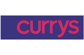
The lettering of the logo is in red, lower case Helvetica on a dark blue background.
Parkes said: ‘We wanted to create a more upmarket look, so we gave it a dark blue background and we kept the red because it's part of Currys' heritage and people recognise it, but we made it a less brash, deeper red.'
The colour scheme is repeated on signs inside the store, with and POS and special offers signs picked out in brighter colours to create a signage hierarchy and make store navigation easier.
.jpg)


.jpg)