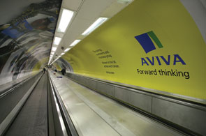
I am not the first commentator to have a pop at Aviva's marketing. And judging by the current standard of their creative work, I won't be the last. Where does one start? The current batch of 48-sheet posters is beyond dull with its pseudo-customer-centric sentiments.
However, let's get into some DM nitty gritty. I somehow managed to notice one of their recent direct response press ads for pensions. While I am the first to admit that it is too easy to pick apart someone else's work, this ad positively begs to get a good kicking.
First, the imagery. We have a shot of an elderly couple on a beach. And guess what's in the foreground? A motorbike. When is a cliché merely that ... a cliché? We all know that communications rely on commonplaces. But the trick is to find a different slant on what we already think about the world. You know, the art of looking sideways. Instead, we have the stock response; the pathetic attempt to "sex up" the proposition with the worn-out "Granny on a Harley" solution.
What about the copy? The headline is in two parts. "Just think of all the things you could do when you retire." Really? Thank you for patronising me ... until I saw your ad I was going to sit in an armchair with my knitting ... but now I am off to buy a Ducatti.
The second part of the headline is straight out of the financial services book of weaseldom: "With Aviva you could get as much as 10% extra income for your retirement". Could? Could? What they really mean is you could NOT. Aviva doesn't know. And we know they don't know. All that financial forecasting is guesswork. Have the grace to treat the audience with some intelligence and explain, adult-to-adult, that choosing a pension is no picnic and the returns will always be uncertain.
Of course, this could have been done in a bit of body copy ... but there isn't any. Just a call to action. Did the copywriter forget to come back from the pub? Mind you, one can hardly blame them.
Finally, Aviva have introduced their branding masterstroke ... a sun flare that runs across the yellow panel like someone's spilt some lemonade on the artwork. What a waste of time. More clutter. But no doubt some designer made a tidy sum from this futile exercise otherwise known as "the brand refresh".
In tough times, when our trust in the world of finance has been shot to hell, is it too much to ask that a major advertiser drops the visual clichés and hackneyed phrases for some empathy and intelligence?


_1.jpg)
.jpg)
