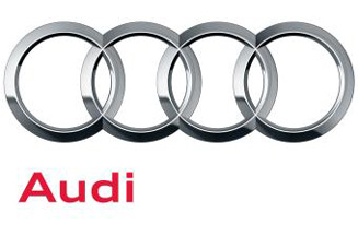
The new logo will continue to feature the long-standing four-ring motif, albeit with a slightly more 3D treatment. However, the traditional red ‘Audi' lettering will now be displayed with a more basic font.
According to Audi, marketing collateral will increasingly use simple light or white spaces and images to ‘complement the understated style for which the Audi range is famous'.
Design agency MetaDesign Berlin created the new logo, while Mutabor Design Hamburg devised wider guidelines for marketing materials. Dutch typographer Paul van der Laan developed the new typeface.
The new visual identity, launhed to coincide with the marque's 100th anniversary, will feature in number of print and outdoor campaigns in the UK over the coming weeks.
However, Audi dealers will not be forced to update dealership branding until they choose to do so.


.jpg)


.jpg)