


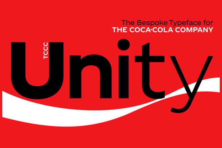
Following a cross-sector trend that grew through 2017, global drinks brand Coca-Cola has unveiled a new typeface: TCCC Unity. Developed by Coca-Cola’s inhouse team with typeface gurus Brody Associates, TCCC Unity is bespoke typography at its best. Simple, rich in substance and reflective of the brand essence.
Coca-Cola is one of the most instantly recognisable brands in the world, but over the years it has adopted a melange of fonts – and whilst the Coke team claims consistency across all media to be the reason behind TCCC Unity, the prospect of some hefty licensing cost savings was probably also a factor here.
Forgotten part of the jigsaw
Until now, Coca-Cola has used a mix of fonts including Gotham, Google fonts and Proxima Nova. In the past, the brand has also leant towards "Trade Gothic" style fonts with a nod to Coca-Cola’s American provenance.
For a brand that possesses a host of unifying design elements, from the instantly recognisable "Coke red" to the curved silhouette of the glass bottles, this curious mishmash of fonts has been a surprise. Vice-president of global design at Coca-Cola, James Sommerville, recently admitted that typography was the "forgotten part of the jigsaw".
The new TCCC Unity (TCCC standing for The Coca-Cola Company) will give Coca-Cola a unique visual voice in every possible instance, from the tiny ingredients details on the back of each can to a bold headline across a billboard.
This is a brand that prides itself on storytelling – an ethos reflected in its new typeface. Every letter tells its own story, from the "Q" designed to look like a glass and straw from above, to the liquidity of the tear drop counter in the lowercase "a".
A human connection
This move by Coca-Cola can be seen as part of a broader trend for major corporate brands to streamline their core assets. From YouTube to the BBC, brands are trying to condense more meaning and distinctiveness into each design element.
To get this right a typeface needs to clearly communicate the brand’s identity and personality. . The letter forms accentuate the presence of a machine; it feels mechanical. There is also a monospace version – good for writing code – and a serif version for longer passages of text.

TCCC Unity captures Coca-Cola’s personality: it accentuates the human hand with softer forms and flicks, drawing a more emotional connection with the reader and reflecting the "uplifting, positive moments" that Coca-Cola looks to create.
The typeface strikes a balance between celebrating the artistry of the brand and functioning practically across all touchpoints. TCCC Unity has been drawn with attributes that mean it’ll work well at small sizes, both in digital and print, and the character and idiosyncrasies throughout mean it’ll be equally powerful as headlines on a billboard.
Design rooted in truth
This isn’t a design created from nothing. In crafting TCCC Unity, the design team explored the full breadth of The Coca-Cola Company archive, from posters to design standards, hand-painted signs and correspondence.
Geometric circular shapes have featured heavily in a lot of ephemera from The Coca-Cola Company’s archive, now reflected in the round forms of TCCC Unity.

The geometry has been softened with flicks and tails inspired by sign writing and the Coca-Cola script logo to improve legibility, for example, a capital "i" and a lower case "l" could be confused. But by adding the flick to the "l" – as if drawn by hand – the two characters can’t be confused.
So, the geometric circular shapes and hand lettering combine to create an authentic piece of artistry full of integrity, character and substance, befitting the modern-day Coca-Cola.
Modernity, neutrality, simplicity
 This is the first original typeface in Coca-Cola’s 130-year history and it’s no surprise that the brand chose Brody Associates to partner on the design. The Brody Associates team behind TCCC Unity also delivered the latest font for Channel 4 – perhaps the defining example of a successful bespoke typeface.
The result is a crisp, clean and distinctive brand asset that will work well both digitally and in print, and the subtle nods to Coca-Cola’s rich history are a delight to discover.
Luke Woodhouse is creative director at Ragged Edge