


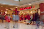
According to the retailer, a revamped logo - featuring white and yellow text on a red background, for both the Wilkinson and Wilko names - aims to refresh and modernise its image on the high street.
The identity will be trialled in four stores that are scheduled for renovation: Hucknall in Nottinghamshire, Walton-on-Thames in Surrey, Leicester and Sheffield. The company's management will measure its impact in the trial outlets before deciding whether to roll it out nationwide.
Wilkinson is also introducing the strapline 'The home of family value' to stress the family-run company's community role and corporate social responsibility work, including its tie with animal welfare charity the RSPCA.
The retailer relaunched its website last year under the Wilkinson Plus+ brand. This autumn it plans to add six stores to its 300-strong chain.
At the time of going to press, Wilkinson refused to disclose whether it was working with a branding agency on the identity overhaul.
.jpg)


.jpg)