


Uber’s original business proposition to users was getting them from point A to point B in style. Eight years since the mobile app launched and with the company under new leadership, Uber has now rolled out its second rebrand in less than three years.
Rebranding is a one of the clearest ways a company can recalibrate the customer relationship or signal a change in direction. When – as is the case with Uber - the rebrand is pushed instantly to the devices of hundreds of millions of users and 1.5 million drivers, the stakes couldn’t be higher.
A rebrand ideally signals confidence. But is there an unwritten rule on how often a company can reinvent itself without appearing lost or losing confidence? Perhaps in the primordial pre-digital past there was, but with "mobile-first" comes an opportunity to update almost constantly while remaining immediately recognisable in the hands of users.
Let’s take a quick tour of some of Uber’s most notable branding milestones.
Design by disruption
Uber’s first app in 2010 was called "ubercab" with the word mark and a red lockup of "u" and "c". The design was representative of a start-up more focused on engineering and logistics than brand design.

Uber’s brand identity continued to shift, and in 2013 the company unveiled a simple, capitalised word mark as its logo. It was a bold, confident identity fitting a high-growth, well-funded global disruptor.

Uber’s next gear shift came in 2016. The company’s ambition was extending beyond transporting people to transportation in general. Uber debuted a new "bits and atoms" icon, and extensions for the various divisions of the seemingly-unstoppable business.

New leadership, new look
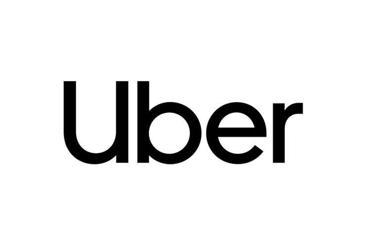
Uber’s logo has shifted with each growth phase of the company. Now, under the new leadership of chief executive Dara Khosrowshahi, the logo has changed once again. All traces of the 2016 icon are gone and the company has returned to a typographic logo.
Instinctively, a new logo invites the viewer to consider how it looks. But to truly evaluate whether Uber’s new identity is any good, we need to put aesthetic judgements to one side and look at five aspects to properly evaluate it.
1 - Culture: It’s hardly necessary to rehash Uber’s tumultuous last few years. With Khosrowshahi’s new leadership came a public commitment to reset the company’s culture and this sparse, sans serif logo instantly speaks to that. The lower-case presentation is perhaps indicative of a company in listening mode.
2 - Safety: Speaking after his appointment, Khosrowshahi made a bold statement on Uber’s purpose: "We have to, as a company, stand for safety." Uber has since released a slew of safety features including an emergency button for drivers and Rider Check should a car make an unexplained stop. In this latest rebrand, Uber developed its own custom font. Clean and easily legible, it embodies the corporate focus on safety.
3 - Recognition: How many users - especially those travelling after a night out - found it hard to recognise the "bits and atoms" icon on their crowded mobile screen so simply opened a competitor’s app? Uber’s return to type is a return to instant name recognition - and in mobile, that can be a distinct competitive advantage.
4 - Scale: Uber operates in 858 cities across 84 countries. By investing in a custom font, Uber has created consistent brand expression across the globe. Having a custom font also means the freedom to implement where needed with fewer restrictions. For a business the size of Uber, owning this essential part of the customer relationship is invaluable.
5 - Data: Uber, like all successful app providers, tracks installs and activations. Pattern changes will quickly indicate if this latest identity is a hit or a miss with users.
So has Uber’s brand identity has lost its way or is the new logo helping the company navigate toward a better relationship with its users? Time will tell. But if we see another brand update soon, don’t assume it means trouble. In today’s world, it’s reluctance to evolve that spells disaster.
Brett Zucker is chief marketing officer of Monotype