 Truly successful marketers, and anyone seeking to sell successfully to marketers, have to be able to do two sequential things.
First, they have to convince the audience in the room that they know what they are doing. That they have thought through all the angles, coolly evaluated all the options, and their recommendation is the most fruitful. That they are, in essence, to be trusted.
Once over that hurdle, their next task is to address the audience at large (the one the money goes on) that their message is worth listening to, and maybe even acting upon. In most cases, if you can’t win over the audience in the room, you’ll never get a shot at the audience in the street.
This two-staged approach to marketing was born in another time, when no one could really prove whether the media money they were about to commit would pay back or not. Before we had accountability, numbers, response levels and proof, we had belief. And great advocacy. Into that void stumbled PowerPoint, the last refuge for people uncomfortable speaking without notes.
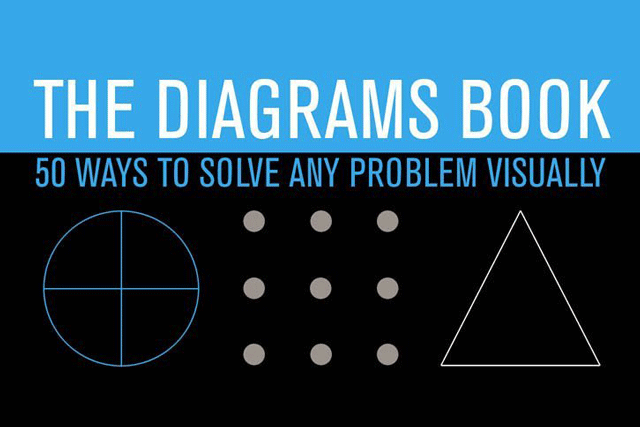
Kevin Duncan’s The Diagrams Book is all about the audience in the room, not the one in the street. He offers 50 shapes within which you can marshal your thoughts, and advance your case.
These range from the facile to the unexpected, but, used properly, they can provide a welcome relief from the wall of words that crowd out the argument of many presentations.
The nature of a book like this means that you have to start stupid and work your way up from basic, through mildly interesting, to the unfamiliar and downright new. Duncan kicks off with triangles and pyramids, moves through squares and axes, circles and pies, before closing with timelines, year-views, flows and concepts.
It will divide opinion. At one end of the spectrum, this is a book to warm the cockles of people who think marketing is just (over-priced) common sense, expressed in chart form. On the other hand, for the true believers, here is a visual language that can be used to make one’s case and win respect.
But that’s not all. Peppered amid the O-level geometry is a healthy dose of coach-speak. The proprietary language of the trainer or business consultant runs throughout, with exercises allowing you to reason, plan and change-manage your way out of any situation.
If that’s your thing, or if you are working in or with an organisation where learning that patois is essential to advancement, then The Diagrams Book does at least deliver this with pictures as well as words. All of which makes it easier for non-speakers like myself to understand, thereby proving irrevocably the worth of the diagrams in general, and this book in particular.
CRIB SHEET
If you only have time for this… five key points from the book.
1 Triangles and pyramids. A gentle opener of a chapter. You’ll find all the base-camp classics, ideal when you have three important things to say but can’t decide which is more important. Look out for a wedge to dramatise gradual increases or declines, and the ubiquitous brand pyramid.
2 Squares and axes. Everyone’s adland favourite, the Boston Matrix, kicks off this chapter, but before long you’ll be scratching over your head over the Gottschaldt Figurine. A modern classic.
3 Circles and pies. After a cautious opening with The Onion, Duncan moves through the Pie Chart and Venn Diagram, before attempting the "From your head to the world" circle. Brave stuff.
4 Timelines and year views. Eight clever ways of helping you stop trying to do everything at once. A must for the multi-tasker, or for people who like to plan their next move, rather than just dive headfirst and see where the current washes them up.
5 Flows and concepts. This chapter opens: "Some ideas need flow. They may need to meander… Rivers, dams, hoppers and buckets. If it’s to do with water, it might help an idea along." I couldn’t have put it better myself.


.jpg)


.jpg)