The identity, created by Wieden + Kennedy, features a "Tesco Bank blue" logo, and will be launched with an in-store and digital campaign to emphasise that Tesco understands what customers "want from a bank".
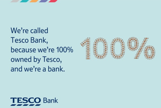
One ad states, "We’re called Tesco Bank, because we’re 100% owned by Tesco, and we’re a bank," while another carries the line, "Our call centres are in the UK, because our customers are in the UK."
All ads with use a colour palette derived from coins and notes, including silver to represent coins, turquoise for a £10 note and orange for a £10 note.

It follows the launch of a social media campaign last month to
, Tesco Bank marketing director Chris Pitt claims that over the 17 years it has been providing financial services, the supermarket has learned what consumers demand from their bank.
He adds: "Tesco serves tens of millions of customers every week. We have 17 million Clubcard customers. We understand how people shop, how they live, the pressures and the perks. We know the significance of every penny and the difference each one can make.
"Customer loyalty to us is a reflection of how well we help our customers manage the pennies and the pounds. Does that sound like a good basis for a bank?"

.jpg)
.jpeg)