


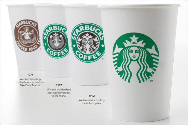
The multi-million pound refresh of the world’s largest coffee chain sees the brand's familiar logo shift from being green and black to solely green.
The outer circle of the logo that included the words Starbucks Coffee has been ditched, giving the siren figure more prominence.
Howard Schultz, the Starbucks chairman, president and chief executive, said the company was at a "very important point" in its history and was seeking a "new blueprint for profitability".
He said: "Even though we have been and always will be a coffee company and retailer, it's possible that we'll have other products with our name on it but no coffee in it."
The move marks the third time the brand has changed its logo since its launch in 1971 in Seattle. The activity will be promoted through a global print and digital campaign in March, created by BBDO.
The new logo will be rolled out to UK stores from 8 March where it will appear on the chain's exteriors, uniforms and in-store material. At the same time, its ceramic mugs will begin to be replaced by ones with a slimmer design. The aim is to rebrand the stores, of which there are 700 in the UK, at a rate of 100 per year.
Steve Barrett, the Starbucks global creative vice-president, told Marketing the new look had tested well with loyal consumers and consequently he did not expect his company to have a similar experience to clothing chain .
Barrett said: "Customers said [the new logo] had positive associations around optimism, doing good and sustainability."
.jpg)


.jpg)