


‘Super’ markets
In the early 1980s, Britain’s big grocery stores were far from super. They were drab, functional places where shoppers just went in, stocked up and got out. For Sainsbury’s then, think Aldi now.
And as for their advertising…
Even worse. Black-and-white newspaper ads, comprising little more than a list of special offers, screaming desperately from a smattering of starbursts.
The quiet revolution
But amid all this, Sainsbury’s awarded its creative account to a small hotshop called Abbott Mead Vickers. AMV believed that Sainsbury’s and its customers deserved better, so they quietly set about creating a campaign that would change a nation forever.
Food for thought
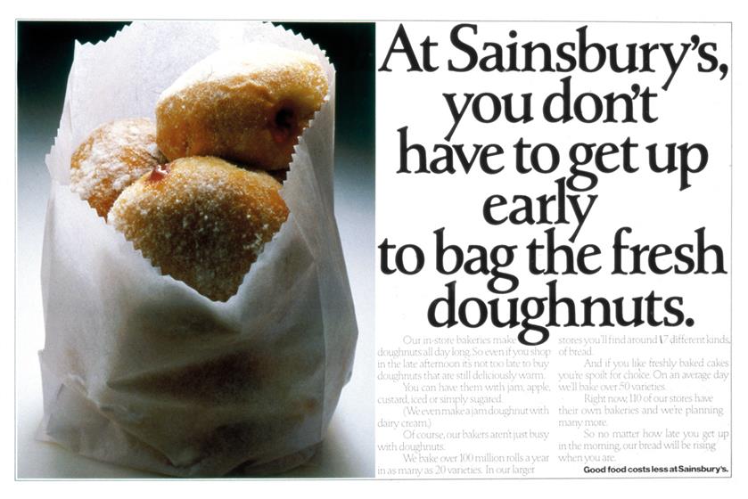
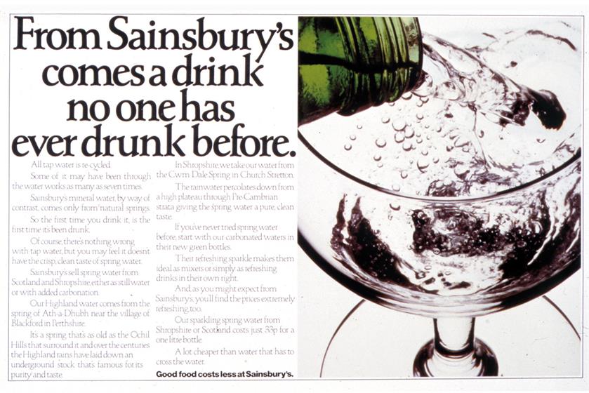
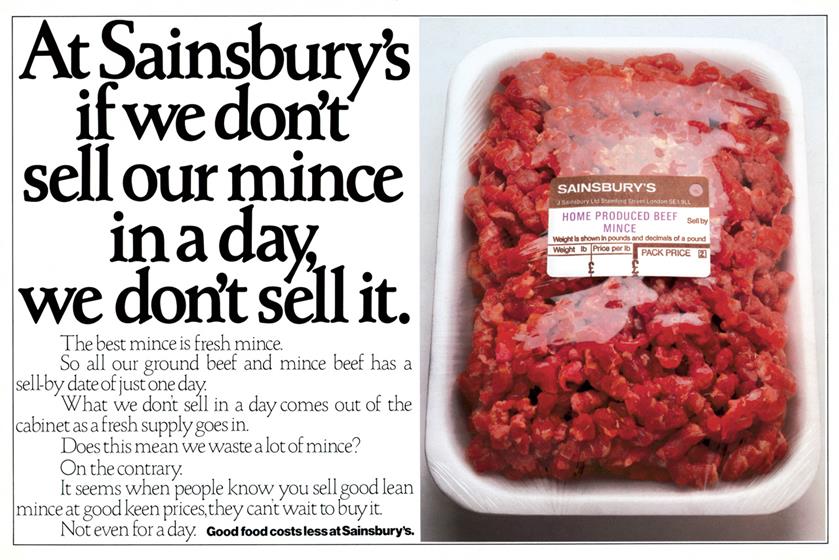
Eschewing the tabloids, AMV took glossy spreads in more upmarket titles such as Cosmopolitan and The Sunday Times Magazine. And instead of cramming as many products as it could on to one page, each ad would devote two pages to one product. The virtues of a bottle of Sainsbury’s wine or a piece of Sainsbury’s Cheddar would be extolled through David Abbott’s elegant prose and Ron Brown’s flawless art direction. One product, one message. Though, behind each small message, there was a much bigger one: our food is better than anyone else’s.
The writer
Abbott’s copy always flowed smoothly and logically, its sentences clicking together like Lego. This was because he took a great deal of time and trouble to make it intelligent, accessible and enjoyable. If you aspire to be a writer, just read anything he wrote for Sainsbury’s and remember that old maxim: "Easy reading, hard writing."
The art director
Brown was a visual craftsman who ensured that even the most ordinary supermarket fare always looked extraordinarily good. Ron’s great skill was to ensure that it wasn’t so much Sainsbury’s selling the food, it was the food selling Sainsbury’s.
The serf
Around this time, I arrived at AMV three days after leaving school. I was in dispatch, where much of the dispatching involved Sainsbury’s. I had to get the food to the shoots and the ads to the publications. This was an era when the type on each piece of artwork had to be painstakingly cut and positioned by scalpel and Cow Gum. Then recut and repositioned several times more because Ron, ever the perfectionist, would invariably make last-minute changes. On one occasion, he was enthusing about the new Dire Straits album. Robin Mann, moving the headline for him yet again, looked up and quipped: "Sounds great, Ron. Did you change all the tracks?"
The wisdom of Stan
It was also a vanished world of printer’s ink and hot metal. A world peopled by printers, blockmakers and van drivers, most of whom were called Les, Vic or Stan. Their significance cannot be ignored because of the countless times they paused the presses while I battled through London traffic with a late piece of Sainsbury’s artwork. On a couple of perilous occasions, riding a borrowed bicycle with the artwork in my mouth. One particular Stan advised me that, to be happy as a delivery boy, I should "make every call a social call". And if there are wiser words for happiness in any occupation, I’m yet to hear them.
The genius of Gummer
Back then, a media buyer was more than just an algorithm in a Topman suit. He – or she – was an integral part of the creative process and Paul Gummer was a perfect example. He bought the media for Sainsbury’s and, although most people assumed that both pages were colour, they weren’t. Gummer’s genius was to buy one page colour and one page black and white. This is why the ads were laid out the way they were. And why Sainsbury’s got a lot more of those beautiful spreads for their money.
They weren’t always beautiful
Sometimes, the quality of printing was less than ideal, and I’d have to draft a letter of complaint to
the guilty publication. Through this, I discovered a love of writing. My dream was – still is – to emulate Abbott’s gentle aplomb. But in order to secure compensation, I could never resist a pinch of invective. When one magazine made a bottle of Sainsbury’s Chablis look an unappealing shade of yellow, I told them their readers might wonder how we got the cat to sit on the bottle. A senior copywriter saw this and suggested I stop writing letters and start writing ads.
The boy from Belfast
So I left AMV to become a copywriter and my first art director was from Northern Ireland. They didn’t have Sainsbury’s there and, having only seen its ads in D&AD Annuals, he’d assumed that Sainsbury’s was on a par with Harrods or Fortnum & Mason. Which, by that time, wasn’t far from the truth.
The rise of Sainsbury’s
That press campaign was a sensation. Critically, commercially and culturally. It altered the UK’s
perception of a tired brand. Sainsbury’s fortunes were transformed, as were its stores – expanded,
improved and generously stocked with exotic new lines to reflect the premium quality of its advertising. It became, by some distance, Britain’s number-one supermarket and one of its most creatively awarded advertisers. What could possibly go wrong?
The fall of ‘Seernsbreeze’
Doubtless it had its reasons, but Sainsbury’s gradually diluted the intelligence and clarity of its message. Perhaps it fell into that fatal trap of thinking that, in order to clean up, you have to dumb down. It seemed to think that provincial shoppers wouldn’t understand it unless addressed in slightly patronising regional accents. Even though shoppers had understood it well enough to buy its food by the truckload. Sainsbury’s was undone by that foolish fear of seeming "elitist". Did it not realise that elitist was the very last thing it was? On the contrary, it had made quality food available to everyone. But it abandoned this all-conquering strategy to scrap it out with Tesco and Asda. It was a scrap Sainsbury’s was never going to win. Pretty soon, it lost its number-one spot to Tesco. A spot it has never regained. Sadder still, it handed its priceless premium positioning to Waitrose. On a plate.
But none of that matters
AMV and Sainsbury’s changed this country forever, and changed it for the better. They created a food phenomenon that shows no signs of stopping. Thanks to them, Britain has the best supermarkets in the world, and their influence has gone beyond that. Nigella, Jamie, Planet Organic, Observer Food Monthly, farmers’ markets, MasterChef, The Great British Bake Off, smashed avocado on sourdough toast. None of these things would have happened without the words and pictures of Abbott and Brown. Wandering through Borough Market last week, looking at all the fabulous food, I wanted to tell everyone there – customers, cooks and stallholders alike – that they owed all this, and so much more, to an ad agency just a few hundred yards down the road.
Paul Burke is an award-winning copywriter and novelist who has worked at Abbott Mead Vickers BBDO, J Walter Thompson, BMP DDB and Y&R