Ron Brown was one of the finest art directors ever to grace our industry.
The campaigns he created with his partner, David Abbott, are some of the greatest and most celebrated in advertising history. The Economist, Sainsbury's, RSPCA, Volvo, to name just a few.
Ron's art direction looked effortless, but it was anything but. He would often be there at his desk or down in the studio after most people had left, perfecting his work.
Ron would bring his craft even to a small space price ad, and give the type just the right weight to punch through and give the ad some air to breathe. It was a joy to see such a master craftsman in action.
As a fellow art director (well, more of an understudy) I’d watch in awe as Ron created the look for award-winning campaigns, from the DPS right through to the shelf wobbler.
Ron would bring his craft even to a small space price ad, and give the type just the right weight to punch through and give the ad some air to breathe. It was a joy to see such a master craftsman in action.
These were the days when print was the mainstay of advertising. David's finely crafted words and vision for campaigns demanded the craftsmanship of Ron.
Type was meticulously put together by hand, spaced with surgical precision. Photography was film based. Art directors and photographers (in Ron’s case it was usually Martin Thompson) would stay late after a shoot to inspect and balance the film and negs, then shoot some more until they had exactly what they wanted.
For the Sainsbury's campaign, Ron produced a classic layout and made the food look delicious. He created memorable ads, without ever once playing with his food.
He even created a beautiful image out of a pack of minced beef – an unpromising subject if ever there was one. To this day, it’s one of my favourites.
But if Ron could do tasteful simplicity for Sainsbury’s, he could do shock tactics to when the brief required it. He created the infamous pile of dead dogs for the RSPCA.
I still remember the artwork, seeing individual black and white shots of dogs carefully put together like a grisly jigsaw puzzle to create the horrific effect.
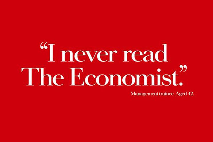
And, perhaps most famously of all, there was The Economist poster campaign. And although the look of the posters was based on the masthead of the magazine, Ron, consummate art director that he was, understood the type had to change. He had the Economist font painstakingly redrawn until it was perfect.
Ron was a man of restraint. He didn't like a fuss. Not in his work and not even when he decided to bow out quietly from AMV 12 years ago. Believe me, we wanted to make more of him, but Ron simply wouldn't hear of it.
For me, he was one of the pillars of AMV. Carved out of beautiful marble and inscribed with the most painstaking and precise lettering.
A pillar that was seldom in the limelight, but was intrinsic to the support of the agency. Thank you, Ron, for everything. Rest in peace.

.jpg)
.jpeg)