


Creative
Walter Campbell
Creative director,
TBWA\London
"Morning, dirty-necks." Pleasantries over. I'll crack on.
Guinness. One of the most forward-thinking brands around. I think Andy Fennell is back running the show, so one of the most forward-thinking clients too. He was the dude who bought the work I did on the brand and helped set the tone of ambition that got it done.
"Made from more", though - I'm not at ease with this new line yet, but I think that could be the weird feeling of ownership you get when you've written a line for a brand and you think you've nailed it. I do love the Guinness brand, so I hope this is the start of an exciting new chapter in its history. It doesn't seem to matter who is in charge at Abbott Mead Vickers BBDO - Abbott, Souter, Brazier - the work is of a standard year in, year out.
Now, you know how you hear people banging on about their cars? Well, recently, I've realised those conversations aren't as interesting/horrifying as they used to be - I think it's because you can't buy a bad car any more. All cars start whatever the weather, they're all comfy-ish and they all go at a decent speed.
When I see an ad from Bartle Bogle Hegarty, I get that same feeling. It doesn't know how to make a bad one. The new Baileys ad is a flawless tribute to Busby Berkeley that does a great job of reminding those enamoured by such things what it tastes like to drink whisky and milk. The endline is quite nice: "Cream with spirit." Only one niggle: when Busby Berkeley did Busby Berkeley in the 30s, nobody had ever seen anything like it. Just saying.
Costa. I actually saw this one on TV. Brilliant. A geek buried in coffee beans. Couldn't take my eyes off the screen. Couldn't wait to see who'd paid for it. Couldn't wait to see how it landed. Shame, the last three seconds - ouch! Fantastic effort, brave, single-minded. Well done, everyone. I would have just cut off the boring tail and let people do that little bit of thinking for themselves, because they're with you at that point.
RAF Reserves are heroic people, doing ordinary jobs, knowing that any minute they could be sent to a country we probably have no business being in to kill people or be killed. I think we shouldn't be in any war the Prime Minister isn't willing to go and die in himself. I wouldn't work on the business if I weren't willing to go do what the target audience is being asked to do.
And, while I'm having a rant, I'm not into the way our armed forces are looked after down the line. I wouldn't have the emotional equipment to look them in the eye and I'm not sure how our Government squares it with themselves when they meet these people. Anyway, I hope this ad doesn't work until we learn to respect the lives of these people.
Brave, principled people here, too, in the British Red Cross ad. Engaging and ominous in a "not trying too hard" way, it feels unsettling. A pale, pointy-nose girl walks through the darkness with her evil dog. She is Crisis and she doesn't care who you are. It reminded me of Michael Haneke's wonderfully disruptive film Funny Games. I got a chill. That's got to be good.
Sitting opposite me as I write this is Sean Doyle. He's quite good, but I'm thinking of trading him in for the dude who wrote the Sunday Times Style ads. Brilliantly effortless: "Ugg was a sound you made." That's poetry, that is. I just wanted about another yard-and-a-half of it.
Is it wrong to offer people jobs live in this column? I don't care. Whoever you are, Sunday Times copywriter, come work at TBWA. Fat Lips is boss.
He has a plan. It includes people like you.

photographer
Dylan Collard
Photographer,
Vue
So, it's post-Olympics and, for me, there seems to be a sudden hive of activity in the advertising world after a lull of a few months. It will be interesting to take a closer look at what's replacing sports references these days ...
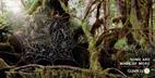
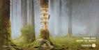
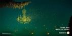
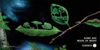
First up is a dream campaign for anyone - Guinness. The TV spot uses a cloud to create a heart-warming take on individuality, courage and freedom. Beautifully shot and directed, it delivers some delicate touches. The tickle of the pylons and the interaction with the traffic lights are lovely, subtle notes that I wish they'd stayed with instead of pushing it towards the heroics of the fire scene. I can see this getting the "ahh ... cute" vote as it leaves me feeling like I've watched Up again. But is it perhaps too much of a departure from the grit, determination, experience and quirk character we associate with Guinness ads?
Meanwhile, Nadav Kander's stills for the campaign are as well-executed as you would expect from one of the UK's leading photographers. The "glow worm" ad delivers the same magic as the TV spot but, for me, the others lack the empathy I felt for the cloud and feel a touch clinical as a result. I would love to have seen a series of Nadav images of the cloud on its journey.
On to the Baileys ad and Bartle Bogle Hegarty's nod to the 30s films of Busby Berkeley. It's visually stunning - the choreography and costume convey a sense of slick, rich smoothness that I associate with Baileys. But I did miss the grand, aircraft-hanger sets that I remember these types of films being synonymous with. I think, because of that, I feel a touch disappointed by the ad despite the big dive ending, which works really well. Great soundtrack, though - I love a bit of Blondie!
The British Red Cross ad is right up my street. Dark and atmospheric, justified by the message that a crisis can be lurking anywhere. Again, beautifully shot with great use of location to complement the narrative. I also liked the Sinead O'Connor-like casting of the lead girl, whose delivery really strengthens the callousness of disaster. The smile she gives as she says "I am the reason you need a wheelchair" is so snide, it cuts to the heart of the sinister message. I bet she can do a great put-down. Great lighting, but a touch heavy on the smoke machine here and there - it's so emo, I get the feeling a vampire might pop up any moment ... still, a great ad.
In a contrast of mood, there's Costa's "coffee heads" by Karmarama, which I think is excellent. Silly, quirky and inane, it had me grinning all the way through. Great casting of the lead, with some top eyebrow work - his performance is pure cheese, with a naff enthusiasm akin to Peter Kay in Is This The Way To Amarillo. The choreography is inspired - I had no idea so much dance expression could be achieved from the head upwards! And it's another brilliant retro, foot-tapping soundtrack.
After all this, the Sunday Times Style ad falls flat for me. It doesn't look like the copy is really stitched on to the silk and then photographed - maybe it comes across better in print than what I'm seeing online. Even so, if you wanted to say it's real and "crafted", why shoot the copy in a flat area in the middle of the fabric, where it just looks dropped in?
Finally, the RAF "live a challenging life" campaign. Ethics aside (I struggle with advertising for the forces), this strong film conveys the idea of the potential within very well. I particularly like the cafe shot morphed with the radar scanner. In fact, the blend of imagery throughout the ad is excellent.
So, based purely on this selection, it seems we've retreated from gold, silver and bronze advertising and back to normality. Loved the Olympics but, from an advertising point of view, I'm glad we don't live with it!