


Why developers should care about design
There are many benefits to developers having a basic knowledge in design. It not only makes your work look better but it can help you communicate and collaborate more effectively with the designers in your team.
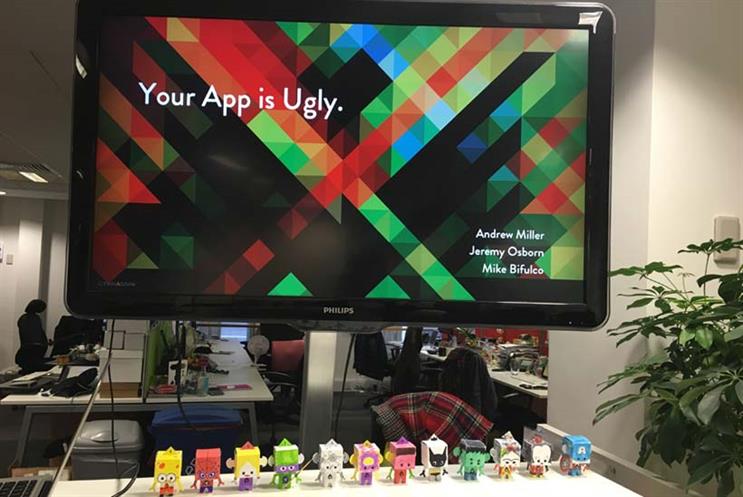
Andrew Miller, programme director of Aquent Gymnasium, opened the ‘Your App Is Ugly’ event with this advice for developers: "People are prepared to overlook design gaffs if your product looks good". He explained the aesthetic-usability effect - a condition whereby users perceive more aesthetically pleasing designs to be easier to use than less aesthetically pleasing designs.
Take for example the two orange juicers below. Which one would you choose on first glance? The one that is most pleasing to the eye or the one that is most practical? A combination of both is ideal but the one that looks good is usually the preferred choice, and the same applies to your designs, including your own portfolio design. As Miller says: "Good design on your portfolio site will make a good impression to prospective employers and clients and will help you get noticed."

The importance of colour
Colour is one of the most important elements of good design but it can carry cultural meaning so you need to be mindful of this in your portfolio design. For example, in Western culture, red can convey excitement, danger or passion, whereas in Eastern culture it normally signifies good luck, celebration and purity. It can also impact accessibility, as people with a colour deficiency or colour blindness will see certain colours differently from those with normal vision.
"Use colour to your advantage but don’t abuse it", says Mike Bifulco, director of technology at Aquent Gymnasium. "Do use the accent colour for your primary action button and components like switches or sliders but don’t use the accent colour for app bars or larger areas of colour."
You can access free colour design guides from , and .

Some Western interpretations of colour
Learn about design
Aquent Gymnasium offers a selection of the most relevant , including ‘Writing for Web and Mobile’, ‘Coding for Designers’ and ‘Modern Web Design’. The courses incorporate a range of assignments, assessments, PDF handouts, code samples and more.
Could such courses boost your career prospects and enhance your portfolio site or CV? "Having an interest in learning new skills helps make you more employable as a designer or developer", says Bifulco. "It shows you have identified areas you want to improve upon and that you have a thirst for knowledge."
Bifulco shared this example: "A visual designer who takes a html course demonstrates they want to understand how other specialisations work - this could open a lot of doors for them. Consider what is relevant for you to be learning now and learn what you want to learn, stop when you want to stop. You don’t have to complete every single course."
They also have a live chat facility, as Bifulco explains: "We’re real people - we’re listening and we have a fab team of teaching assistants on hand."

Mike Bifulco presenting at ‘Your App Is Ugly’ event
Communicate and collaborate
The event made it apparent that designers and developers have to love each other to work together. Jeremy Osborn, Gymnasium’s academic director, commented: "The secret lies in communication and collaboration. It’s all about human connections: get designers and developers to sit together. Encourage open critiquing and don’t bring your egos to work with you".
Drew Maughan, a freelance web developer who attended the event, gave his take on the event’s topics: "As a developer I struggle to make websites look good, so I usually hire someone to take care of the design features for me. Attending this event has give me some design ideas I can implement myself.
"Designers often dictate what a website looks like and make most of the decisions. I would like to see designers and developers work together more effectively and make joint decisions."
Top tips for designing your portfolio site:
1. Be consistent. Font sizes, colours, spacing and alignment should be universal for any given interface, otherwise users will waste time trying to figure out why something is minutely different.
2, Create a context hierarchy. Consider grouping, size, contrast/colour and typeface.
3. Be mindful of colour choices. The colourblind will thank you. Also, take into account any cultural interpretations of different colours you choose.
Finally, if you do complete an Aquent Gymnasium course, you can get a badge which you can post on your LinkedIn profile and on your portfolio site.
Looking for a new role? Browse and apply for the latest jobs from Aquent / Vitamin T