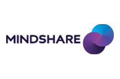
Developed in partnership with branding agency Moving Brands, the rebrand coincides with the agency’s ongoing global restructure announced earlier this year.
The new logo retains the signature colour, purple, established at its inception from the merger of JWT and Ogilvy & Mather media departments in 1997, but includes a refresh of the agency’s brandmark and visual identity.
Two circles have also been added to Mindshare’s logo, individually referred to as a "bespoke wordmark" and a new "partner symbol", to reflect the "structure and form" of Mindshare’s new business.
The changes are the first to the agency’s branding since it launched more than 10 years ago, but it has already raised eyebrows within the industry.
One UK agency leader said: "I am really struggling to see the point of this. If there were significant changes then you could justify the expense of commissioning the design agency, not to mention rolling out new stationery and office insignia around the world.
"I wouldn’t be surprised if those two circles and small ‘s’ end up costing in the region of £250,000."
Announcing the new identity, a company statement said the two forms coming together reflected Mindshare’s partnerships with clients, suppliers and other agencies. It continued: "The flow of colour symbolises the flow of creativity across the business and the segmentation mirrors the bringing together of specialist expertise within Mindshare’s ‘open source’ approach to client business which enhances a platform neutral approach."
The lower case s to be used on the printed page is said to represent the agency’s new simplified approach, re-engineering its structure from more than a dozen separate specialist departments to four integrated, collaborative groups: client leadership, business planning, invention and the exchange. Mindshare will be written in upper case lettering outside of prose.
Dominic Proctor, chief executive of Mindshare Worldwide, defended the new look, saying it formed part of the agency’s objective to be the agency of the future. He added: "This has been the result of input from our offices around the world and reflects the consistency of our global network, one of our greatest assets, and our continuing ambition to set the agenda in our market in partnership with our clients."


.jpg)


.jpg)