


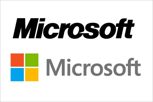
The update, which is the first for the company in 25 years, is a simplified version of its previous logo. The typeface is Segoe font, used for its products and marketing communications. The symbol, which consists of squares of different colours, is now square, rather than wavy.
From today (24 August), the logo will be used more prominently and will appear on the company’s website, and in three retail stores in the US, rolling out to all its stores over the next few months.
It is also feature in all of Microsoft’s global marketing, and will be used to sign off all forthcoming TV ad campaigns.
Writing on the company's yesterday, Jeffrey Meisner, general manager, brand strategy at Microsoft, said that "now is the perfect time" for a new logo, as it gears up to launch its Windows 8 operating system, Windows Phone 8, its next version of Office, and its debut tablet, the Surface, in the next few months
He claims the new logo will give a common look and feel to its products and a "seamless" user experience, waiving in a "new era" for the company, which is facing tough competition from Apple and Google in internet and technology market.
The new logo comes shortly after Microsoft announced it was scrapping its web-based email brand Hotmail, in favour of its other email brand, Outlook.
.jpg)


.jpg)