


I’m never happier than with a bottle of ink, a big old brush and some paper. I love working like that – there’s lots of happy accidents, lots of human error. It’s good to not always have complete control over what you are creating as it can add personality to your work.
As a child, I loved the animated title sequences from old shows such as The Pink Panther, Bewitched and I Dream of Jeannie. Later, when I was at design college, I was mainly influenced by American graphic designers from the 1960s, 1970s and 1980s – Paul Rand, Herb Lubalin, Alexander Girard and Saul Bass, to name a few. The designs themselves were quite pared back (because obviously they didn’t have Photoshop and Illustrator and all the trappings of modern technology). It was these beautifully handcrafted, quite playful illustrative typography shapes.
When I graduated from my graphic design degree, I decided I was going to be a hand-lettering artist, which was slightly strange at the time, because in the early 1990s it wasn’t a career choice. I felt like I was born into the wrong era.
Someone suggested to me that advertising agencies would be a good place to start, so I lugged a huge portfolio around all the shops, asking for opportunities and advice from agency designers. Agents thought my work was nice, but didn’t really know if there was much call for a hand-lettering artist, so I was put off quite a bit. It took me a while until that could be my only source of income, but gosh there are so many hand-lettering artists now. It’s really trendy and it’s a totally viable career path.
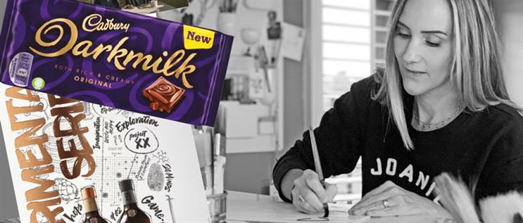
My first big brief was a dozen posters for a Waterstones Christmas campaign. They were everywhere, all over London, and that was the first time I’d had a proper, meaty commission.
The work that I did really early in my career was really naive to me. Obviously, with any kind of craft you’re learning and improving all the time, so I tend to prefer my recent stuff. But I’m still fond of my early work because it was part of the path to where I am now.
I worked with Age UK in 2019 for a campaign about elderly people feeling lonely, and that was quite challenging for me [because] I had to authentically write in older people’s handwriting, which is actually a lot harder than it sounds.
There are lots of nuances in handwriting, which can convey different emotions – you can instantly tell from looking at someone’s handwriting who they are. And depending on the brand you’re working with and what the message is that you’re trying to convey, you can get an emotional response from it. I still collect discarded shopping lists and letters from elderly relatives, any handwriting that’s got a little bit of character to it.
I always make a point of returning to my early influences when I feel overwhelmed by the deluge of visual stimulation on platforms such as Instagram and Pinterest. If you replicate on-trend styles, you are in danger of making yourself completely invisible.
That said, finding your own style of work is probably the hardest thing to do and, for me, it’s always a work in progress. I do find that I think more creatively when I step away from social media and look at other people’s work. It helps steer ideas in my direction.
My thing is, I’ve never had a loyalty to a particular style of lettering, so I don’t know whether my work is recognisable or not because
I try to be as diverse as possible. I never know whether that’s a good thing or a bad thing, but it has kind of worked for me, I guess.
As told to Emmét McGonagle
Alison Carmichael is a hand-lettering artist who has worked for brands including Time Out, Halifax and Stella Artois. The illustrator recently replicated the handwriting of older people to showcase the emotional perils of loneliness for Age UK.