


When it comes to choosing products and services, there is no denying that, at present, small is good. The days of a special and exclusive consumer trust in megabrands are all but gone, especially in the food and drink sector. We no longer look to the likes of Heinz, Kellogg and Wall's for aspirational
purchases, but to the homespun delights of Mrs Massey's (for sauces) and Debbie & Andrew's (for sausages). To avoid shovelling more cash into the coffers of Tesco and Sainsbury's, shoppers with the time and money may well visit the local farmers' market for some straight-from-the-field goodness that cuts out the middle corporation.
This trend has been developing for some time, and is part of a host of gradually shifting attitudes toward health, the environment, ethical trading, community and consumerism. We may not be quite ready for 'no logo', but perhaps 'little logo' will do nicely. It is these small, entrepreneurial brands that have adopted a style and tone of presentation in their marketing that is often both colloquial and premium, friendly and luxurious, and in which packaging design plays a crucial role.
The visual and written languages of brands such as Darling Spuds, Dorset Cereals and Munchy Seeds have been developed by designers who realise that it is the very smallness (or apparent smallness) of the business that is its selling point. 'When you read our packs, you are talking directly to us' is effectively what the Elmwood-designed Debbie & Andrew's packaging says. Compare this with the website of global food business Kerry Group, owner of Wall's sausages, which on its homepage displays the company's latest share price.
'One obvious difference of smaller enterprises is that they are often owner-managed - one person with a single vision - and are not subject to the endless processes and approval systems of bigger companies', says Martin Grimer, creative director at Blue Marlin Brand Design. 'As a result, many of them are more creative in their marketing strategies and approach to choosing their media channels and developing executions within them.'
Moreover, smaller companies are able to embed the brand values of their products in their corporate tone of voice, according to Magnus Willis, founding partner of branding consultancy Sparkler. 'It is a branding process that works inside out. Starting with an analysis and appreciation of a corporate culture and the vision of the owners, rather than an analysis of what the competition is up to, is increasingly the way to go,' he says.
Nick Gray, managing director of retail marketing agency Live & Breathe, believes that this kind of cultural difference can be particularly beneficial to the design process. 'The approach of smaller enterprises is different from corporations, and that affects the creative output,' he says. 'There is normally a clear vision that is easier to filter through to the end product. It is not design by committee, not the lowest common denominator, so they are more able to take risks.'
Such small to medium-sized enterprises (SMEs) are abundant, and not just in the food and drink sectors. Of the UK's 4.5m business enterprises, 99% fall into this category, accounting for more than half of the UK's business turnover of about £2,600bn. Of these, 95% are micro businesses with 20 or fewer employees.
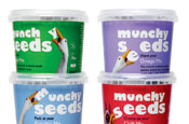
For examples, one need look no further than the husband and wife team behind Munchy Seeds and Salty Dog crisps. Opportunities for design agencies to tap into these small-scale, entrepreneurial businesses are rife. Although the budgets are often small, some agencies are even setting up 'creative contracts', which give them a stake in these businesses and, consequently, a vested interest in their success.
In fact, it seems that smaller budgets often lead to more creative packaging solutions. 'Start-ups and SMEs see how powerful design is, and they are not afraid to use it,' says Richard Hill, creative director at Lloyd Northover. 'These business owners have grown up with the ability to do it themselves and see the possibility of self-authorship.' Jon Davies, managing director of branding and design agency Holmes & Marchant, agrees. 'SMEs have less to spend on traditional advertising, so they need to invest their limited budget wisely and ensure that all the communication is consistent, impactful, memorable, recognisable and outstanding,' he says. 'Packaging is the centrepoint of this, and every aspect of it should play a part in telling the brand's story of difference.'
The shift of focus toward packaging design is partly due to broader changes in marketing media, claims Jeremy Haines, director of Salty Dog's design agency Haines McGregor.
'In the grocery sector, there was a time when brands saw marketing as a measure of how much money they could spend on advertising,' he says. Now, the packaging is being asked to work harder. Brands, especially smaller ones, have created a greater number of touchpoints around customers' encounters with the brand.
It is not merely smaller companies using packaging as a primary communications medium, but this shift away from above-the-line advertising puts SMEs on a more level playing field. This is where the flexibility and innovation of a small business can come to the fore.
Start-up enterprise The Filthy Food Company appointed design agency Elmwood to help it develop a range of indulgent desserts. 'Our original brief to Elmwood was very woolly in terms
of what we wanted to achieve, but I wanted to work through the brand creation together, and we looked at a gap in the market to define the brand,' explains Simon Smith, founder of Filthy Food. 'As we became more confident about where we were going, it became easier to invest a bit more.' Packaging for the range, which is now stocked in Sainsbury's, plays on the idea of illicit indulgence, with phrases such as 'disgracefully smooth' and 'dressed to kill'.
Perhaps more common in the SME food and drink sector are branding and copywriting that emphasise wholesomeness, provenance and personable proprietors. Here, corporate copy style is eschewed in favour of a more personal approach.
'We take delicious things and add some more delicious things' chirrups Dorset Cereals' unbleached cardboard pack, for example. 'This looks like it comes from the farm gate, not the factory. It alludes to a product that is hand-generated rather than manufactured,' says Hill. Salty Dog packs, meanwhile, aim to offer reassurance on the products' provenance. 'We make sure all our potatoes are of the highest pedigree,' they read. 'They are handcooked in sunflower oil for extra bite, and then seasoned with deliciously feisty flavours.'
This type of friendly tone and design pays dividends for many brands. 'SME brands have a voice, an openness and an honesty,' says Davies. The questions remains, however, as to whether it is becoming harder for them to stand out from the crowd in a post-Innocent Drinks world?
'There can be a scepticism about peeling back the [corporate] layers and all the stuff about history and provenance, but there is still a lot of demand for it,' adds Haines. 'Many people are not yet that cynical, although it may be coming.'
Peggy Connor, head of design at the AAR, is less optimistic. 'In many cases, there is not much content, just a chatty voice. Someone led and a lot of people followed, and now there is so much of this imagery used that consumers simply cannot trust the language any more.'
Whether shoppers will come to distrust this approach remains to be seen. Designers' use of such short stories on packaging to engage consumers has certainly brightened up the grocery shelves, but the real test will be whether agencies can continue to produce stories that consumers want to see, read and, ultimately, put into their trolleys.
Case study: Glengoyne Burnfoot
Ian Macleod Distillers is an independent family company producing a portfolio of whiskies and other spirits under its own labels, as well as for the own-brand market.
The company wanted to build its presence in the travel retail market and decided to create a whisky brand exclusively aimed at this sector. As a result, director of marketing Iain Weir was looking for a design that would convey premium luxury qualities, stand out among major players such as Johnnie Walker and Glenfiddich, and avoid the cliches normally associated with Scotch whisky design.
'We worked with travel retail consultant Andy Lane, who sat in on the conversation when we approached [design agency] Navyblue,' explains Weir. 'We wanted something a bit different with extra standout so we could create a product that was a real exclusive for the travel retail channel. We wanted to reach a fresh, curious and aspiring audience.'
The packaging design by Navyblue features a fluorescent gold ink to depict the contour lines of a map, evoking the idea that the whisky flows through the land around the Glengoyne distillery.
The use of GPS co-ordinates adds a contemporary detail that gives the design a point of difference from competitor brands' packaging, while on-pack copy tells the story with 'irreverence and rebelliousness', according to Weir. 'We're a medium-sized business, so we have a level of flexibility that perhaps some of our bigger competitors don't,' he says. 'We can push a little bit further and design is a key influence on people who are browsing and captive.'
Since its launch, Glengoyne Burnfoot has won a Duty Free News International award, a gold medal in Wine & Spirit magazine's 2008 design awards, and
a highly commended accolade at the Drinks International Travel Retail Awards. According to Weir, it is still securing listings and will hit retailers' shelves this spring.
Do you think there are too many Innocent Drinks-style designs? Join the .