


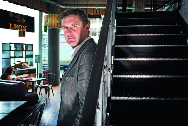
The weather may be a happy accident and beyond co-founder John Vincent’s control, but the atmosphere, menu and design detail that make Leon stand out among restaurant chains are dictated by anything but chance.
Since the first Leon opened in London’s Carnaby Street in 2004 – the brainchild of Vincent, Henry Dimbleby and chef Allegra McEvedy – it has stood out from the fast-food crowd in everything from its typography to its interior design, cookbooks and packaging. So, has the design strategy evolved as the business expanded?
"It was always very important," says Vincent. "We are in a sector where you have to get everything right; it starts with the food but you have to get the culture, design and location right. It’s like unpicking a code. Design is critical, yet no more or less important than any of the other items."
At the centre of Leon’s brand design strategy was the desire not to communicate too explicitly but, rather, use implicit messaging. "We’re not saying ‘Come try our world-famous healthy Mediterranean food’ – we never say ‘healthy’ or ‘Mediterranean’, even though they’re at the heart of the concept. It’s that old phrase ‘You can either tell someone you’re funny or you can make them laugh.’ If you make
it too explicit, then it’s not a seduction process, and not an authentic process," he explains.
It makes sense to start with the menu, which offers breakfasts, lunches, children’s options, afternoon treats and dinners. The food is simple and tasty, encompassing a selection of wraps, salads, hot dishes and drinks.
"We imagined Leon being a table at the centre of a Mediterranean house or village fête, changing rhythmically with the day and vitally reflecting the freshness of the ingredients," says Vincent. The choice is limited (more by what they can fit on the boards than what the kitchen can cope with) and is tweaked, although Vincent says it had evolved too much and plans to re-introduce old favourites such as salsa verde, halloumi wrap and fish-finger wrap.
"We benchmark fast-food operators and other companies, such as how many SKUs we have, how many items in the pass," he explains. Where the restaurant design allows, glass-fronted fridges are used "to bring you closer to the ingredients".
The quality of the ingredients is also central to the brand and Vincent and his colleagues go to great lengths to source the best: "We delayed a fruit-and-nut snack for six months because we wanted to source cranberries that didn’t have [added] sugar."
VISUAL PERSONALITY
Similarly close attention has been paid to the menu, while the thought given to design detail around the food is clear – from the menu boards hanging above the food counter to the packaging.
"The design is based on fruit packaging. If you look at our bags or boxes, they are simple, brown-paper cardboard boxes; that’s an analogy for the simplicity of the ingredients. Then we put a sticker on them that says ‘We haven’t made this product, we’ve just found the best ingredients for you’."
While the food packaging was determined before the first Leon opened, the interior design has developed over time. There is a remarkable elasticity in this aspect of the company’s look, while maintaining a consistent overall feel. For instance, the Leon sign in the restaurants differs from one location to another. "There is no real logo and some of the shops have a different typeface – rightly or wrongly – and all of the stickers are different. We wanted it to be instantly recognisable as Leon but very flexible," explains Vincent.
Many of the restaurants have evolved to become less cluttered, losing some of the bric-a-brac that used to populate them. Vincent adds that he still feels they haven’t got it quite right – with the
exception of the new King’s Cross branch.
While most of the branding and design strategy has been crafted by Vincent and his co-founders, at various points in the process they have brought in external advisers. One was Bambi Sloane – "an amazing interior designer and very non-architectural," he says. "She took us on a journey of humanising Leon. So we made a much more human story about personifying Leon when we opened at Ludgate Circus." He name-drops others, including "best friend" Richard Reed, of Innocent Drinks fame, and design guru Wally Olins.
This personification of Leon is at the heart of its strategy. Leon is Vincent’s father’s name, although he makes the distinction that the company is not named after him but, rather, "we just took the name" (apparently, his dad "pretends to mind").
PERSONAL STRATEGY
One of the great standout features of Leon is the way in which each restaurant’s walls are covered with photos from the founders’ family albums. No stock shots here, but genuine holiday snaps, rich with windswept hair, dated swimming costumes, gauche teenagers, proud parents and joyous moments of family harmony. They draw the diner in and compel them to scrutinise them, not least because they feel like shots many of us would find if we rifled through our own albums.
"The photos tell the story of our family; mine is from the Mediterranean and Henry’s mother is from Syria, so the photos are from our English holidays and Mediterranean roots. We will open a new album for a new restaurant; if we open one in an airport, it will be based on my mum’s bridesmaid Glynis, who was a flight attendant."
Adding further restaurants is part of the strategy – Vincent describes the expansion plans as "grandiose, but we’ll start very slowly". Three sites will open this year, two franchise stores in transport locations, then four more next year. At some point he wants to expand into the US, and is interested in Germany for its "really good food culture".
The company will partner Brad Blum, a former Burger King executive, to help with the US expansion, and food-service company HMSHost on franchised stores.
The brand strategy is to be sympathetic to the locations it chooses, not bullying or dominating. "What should stay the same and what should change with a new site? We explain to our designers that you don’t have to change very much to get something different. So when we go to Manchester, what needs to stay the same and what needs to adapt? And if we’re going to go into an historic place, we want the aesthetic to reflect the history of that place," says Vincent.
The Leon brand’s tone of voice was carefully considered, and here Vincent’s friendship with Reed had an influence. "We launched when Innocent was is its first flush, so we deliberately avoided the extreme chumminess of the Innocent tone of voice. Paul Burke (the Abbott Mead Vickers BBDO creative), who wrote a book called Father Frank, helped us with the little lines. We were conscious of keeping it quite straight – if there’s a joke, it’s to convey a message, not as a nervous aside," he adds.
In the fast-food industry, one of the most important manifestations of brand is the service. With 250 people on Leon’s front line, Vincent knows it is not going to be 100% perfect.
"It’s impossible to live up to the promise every single time. However, we train people on the idea of ‘moments of truth’, which are opportunities to delight a customer, and a ‘glimpse of brilliance’ is something you create in light of that moment. Someone knocking over a drink, or confused about what to order, is a moment of truth. We focus on accountability and responsibility, not a victim mentality: what does it mean to be accountable; what can I do to solve this? It’s an implicit way of creating a culture."
He adds: "Rather than beating the team up for things they’ve not done right, we believe in focusing on what is working and making more of that."
The one area in which Vincent thinks Leon has most to do is social media. "We don’t know enough about it," he admits. "We have no social-media plan; it’s totally reactive and ad hoc. We would like to think things through more. We’re under-exploiting it – we have so many interesting stories around our food initiatives, but we’re not as good at social as we should be."
BETTER BY DESIGN
Not all aspects of Leon’s digital marketing are lacking, however. Its website design maintains the brand’s look and feel while offering more background, nutritional information and recipes.
Vincent drives Leon’s design ethos and has kept tight reins on its brand design strategy. He has a grounding in branding and design, having joined Procter & Gamble and worked on Max Factor and Olay after graduating from Cambridge. He then moved to global management consulting firm Bain & Co, holding various roles including project leader and consultant.
He says there are common mistakes designers coming to work with Leon makes about the brand. They make it look too pastiche, like a retro brand, too Northern European, too Americana or too kooky and homespun.
Ultimately, though, no matter how keen Vincent’s attention to design details, it always comes back to the food.
While the menu is a selection of unashamedly healthy fast food, that’s not part of the communication. If you want the details, every item on the menu is on the website with icons to steer those interested in information on calories, glycaemic loads and saturated fat. A cute devil’s fork icon marks the more waistband-busting "treats".
At Vincent’s metaphorical Mediterranean table, all food is to be enjoyed rather than medicalised or strictly calorie-counted. His is a guilt-free feast of delights.
What other experts think
 Why is the Leon approach a recipe for success?
Leon understands the power of branding – that a strong brand encompasses more than a nice logo and comfy chairs; the offer must be at the heart of everything it does. Leon’s product is linked to its brand purpose: fast, Mediterranean freshness.
Next move for Leon?
As Leon spreads its wings, it must keep sight of what has made it successful. One of its greatest strengths is its compelling brand story. But in an overseas franchise, the Mediterranean family photos that work well in London could feel like an imposition. No two branches look identical and that adds to the brand’s homely character. In the future, it’s imperative that Leon sets down well-thought-out parameters to define where and how much flexibility is appropriate. Otherwise, it risks creating confusion and brand dilution.
Leon will have to work harder than ever and express its purpose at every touchpoint. The brand already excels at manifesting this through the look and feel of its restaurants, cookbooks and even its CSR activities. But it has the opportunity to go further and design a service experience rooted in the core values of Mediterranean freshness, without borrowing the rituals of other fast-food chains with all their negative associations.
Alastair Jones, head of client services, Echo Brand Design
 London bubble or national brand?
Definitely a national brand. The human approach appeals to a wide audience beyond London. The love of fast food extends internationally. Leon’s take on providing a more personal experience is unique and will stretch – its USP is irresistible. Family treasures that cover the walls play on the emotions of consumers, evoking similar thoughts and emotions from their own memories. Being sympathetic to locations further highlights Leon as having elasticity in this respect, combining good food with a human, emotional appeal.
Next move?
As Leon rolls out nationally, it should focus on similar urban locations, but the more it ventures into market towns, the more it will need to adjust its brand while staying true to its core. For example, a bespoke kids lunchbox (healthy, but not using that word) would help it make its mark while staying on brand.
It might adopt similar bold innovations to deliver success in the US, which already has a plethora of tailored, healthy and gourmet fast-food offerings, particularly on the coasts and in more health-conscious hotspots.
Simon Ward, chief executive, Holmes & Marchant
 A design leader?
From a design perspective, Leon feels completely in tune with where the strongest brands are heading. Its distinctive visual language is fluid, adaptive and sympathetic to its surroundings. I consider it to be a design leader on this philosophy alone. It shows it is thinking intuitively about brand management and how it is expressed in the wider environment. That no two Leon logos look the same shows this physical brand is delivered in a fresh, modern and polymorphic way. It is also vital for the health of our high streets that we position national brands in relevant ways for their communities.
Next move for Leon?
How could Leon extend its much-loved food ethos to offices or workspaces?
Why is the Leon approach a recipe for success?
When care, pride and authenticity lie at the heart of your brand, you are on to a winner. When you imbue every action with these values, from recipes to staff training, you have an irresistible, vibrant proposition. Vincent is always thinking about how to make Leon better – for diners, staff and the community – and you can feel it as soon as you enter. The team structure means the staff all feel a sense of ownership and responsibility. It will be fascinating to see how this strength of culture can be retained as the business grows.
James Ramsden, creative director, Rufus Leonard
See more insight on