


-
Guardian-Thatcher-1280.jpg
-
Guardian Thatcher .jpg
of

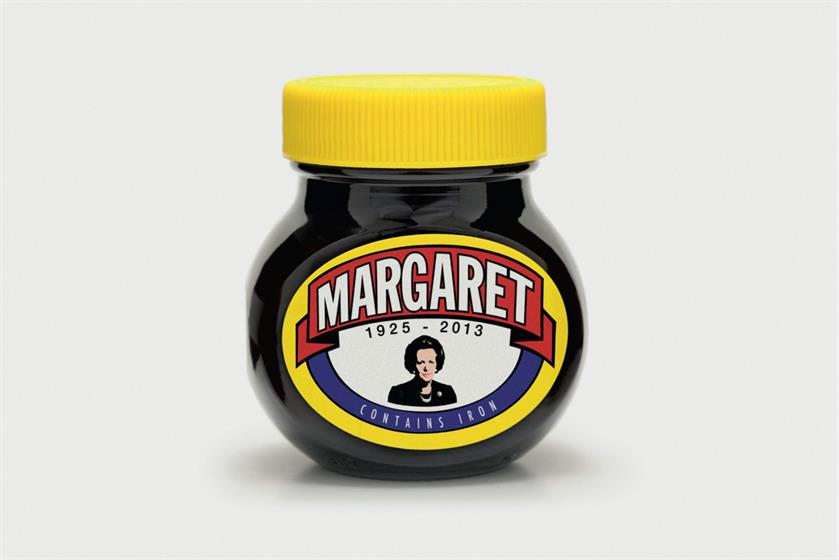
Tell us something about the making of this ad. It was fast. The creatives came up with the idea in the morning and by lunchtime the client had bought it. That left the afternoon for me to do my thing. Bringing it to life was very straightforward as most of the design and typography was a direct pastiche from the original Marmite label. The main area where I could enhance the concept was in the illustration of Maggie, which stylistically I tried to nod towards Jamie Reid’s Sex Pistols artwork. And I also changed the green bar at the base of the jar to blue, which houses the killer line "contains iron".
How did you get into typography? I guess it comes from a love of words and the frustration of not being able to spell them. It’s a love-hate relationship (cheesy link).
What are you most proud of? I’d have to say that it’s the current Guardian branding. It does a great job of allowing the creative within it to have a personality and uniqueness of its own but doesn’t detract from the brand itself (it’s magic), in a similar way to George Lois’ Esquire covers. (Did I just compare myself to George Lois?)
What inspires you? The catalyst for almost everything I do stems from music and anything that’s a by-product of it. Beyond that, it’s a good film, good book, good cup of tea, good laugh and good night’s sleep (around ten hours per night, if possible).
Tell us something unusual about yourself. Mark Reddy, our head of art, doesn’t think I can run, let alone do a sub-three-hour marathon time*. Achieving that would be unusual. Apart from that, I’m pretty usual.
*At the time of this article going to press, James had failed to achieve his goal and was forced to eat his words. That’s OK – he likes words.