


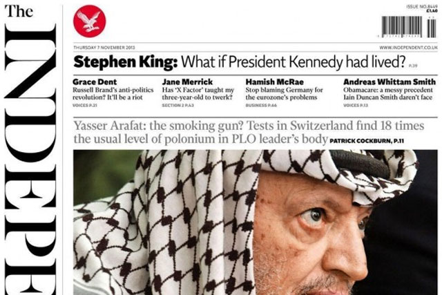
The new-look Independent has returned its masthead from red to black, and it runs vertically up its front cover. The return of serif fonts, and stripped back colour aims for a more elegant look.
The redesign hopes to allow for high-impact stories on the front pages, while inside provides a new platform for the paper’s international perspective alongside more integrated commentary and analysis.
The redesign also includes a new section, ‘Section 2’, which features generalist and specialist features in addition to Arts coverage. Obituaries, Business and Sports pages remain in their current positions but incorporate the new design and style.
The Independent on Saturday is also going under the knife this weekend, with a new masthead, imagery and black and white print.
Amol Rajan, editor of The Independent, said: "We wanted to go back to the future and embrace the maxim of our first editor Andreas Whittam Smith to develop a design that is 'classic, with a twist'. The new-look paper highlights our best elements; it is true to our heritage, but also radical and innovative – as The Independent has always been – and also incorporates a strong dose of mischief."
Along with the paper, The Independent’s website has also had a facelift and parent ESI Media is set to launch a new tablet app for The Independent in December.
The app will combine interactive (digital) and replica (PDF) editions for mobile and tablet users and will be available on iOS, Android and Kindle Fire devices.
The app will be curated and refreshed several times throughout the day with prominent promotion of social media sharing, commenting, photo galleries and video, as well as interactive crosswords, Sudoku and Codeword and weather reports that can be customised depending on location.
Using the same technology, ESI has launched an app for its London Evening Standard newspaper today.

.jpg)


.jpg)