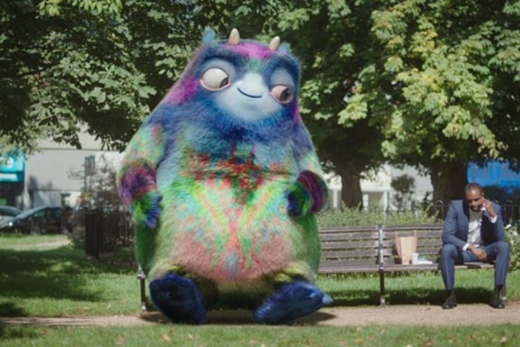
It’s a dangerous game to create a character that physically represents your product. It always feels like you’re trying to hide its true nature
The biggest problem all advertisers face is being remembered; the second biggest, being remembered for the right reasons. Characters have long been employed to make messaging more memorable. But there is no rule of thumb on whether characters work. For every Honey Monster or Aleksandr the Meerkat, there are countless other creations destined to fall well short of our consciousness, never mind our affections.
So will Workie, the new ‘physical embodiment of the workplace pension’ help land the DWP’s message. First off, it’s a dangerous game to create a character that physically represents your product. It always feels like you’re trying to hide its true nature. Have a character spokesperson, a brand adversary or admirer, just not a character that is the actual product. When we first see Workie, the voiceover nonchalantly informs us, "Oh, there’s the workplace pension." Oh dear.
So, the workplace pension is a fifteen-foot tall, global hypercolour, Pixar-esque creature by committee. It looks like the kind of thing I occasionally see embarrassed teenagers manhandling through Staines station, suddenly regretting their dart-throwing skills at Thorpe Park.
Cute horns
I get that the workplace pension itself is an abstract concept; so characterising it might make it more memorable. I see that Workie is designed to tick the boxes of being nothing to fear: big eyes, cute horns, technicolour fur. Workie’s size and appearance are designed to highlight the key DWP message, not to ignore the benefits of workplace pensions. The message is clear if you’re listening – but I’m not. I’m thinking, what the hell is that!? If you’re going to have a mute character, take a leaf out of John Lewis’ book and pick something that we all recognise – like a bear, hare or penguin.
Alternatively, how about giving Workie a voice and a personality? That would be a much better idea. If Workie talked, we might listen rather than just stare. That for me is a greater failing than the way Workie looks. We quickly look past the appearance of a sock puppet if it engages us verbally.
We quickly look past the appearance of a sock puppet if it engages us verbally
Aleksandr the Meerkat is memorable not just because he’s a meerkat, but because he’s a strange Russian meerkat with nuances of Terry Thomas and Roger Moore. Few people understand successful character creation and writing as well as Darren Bailes, which is why Aleksandr made it into the nation’s affections.
If Workie was designed to make pensions feel friendly, then the creators shouldn’t have stopped the character development at the visual stage. That’s left Workie looking like the only one who turned up in fancy dress to a serious discussion. Embarrassing. The right voice and diligence in character development might have allowed Workie to tackle an issue as complex and confusing as pensions, regardless of appearance.
The DWP weren’t wrong to try something different. They were wrong not to push the agency beyond the superficial here. It’s the commitment you put into making a character come alive, that separates the great advertising characters from the fairground cuddly toys.


.jpg)
.jpeg)
