The identity, created for the core terrestrial channel by DixonBaxi, will be unveiled on-screen on 6 October. The new-look logo, now in capitals and with a different typeface, will appear in various colours.
At the same time, the channel will make changes to the way in which it uses its supporting marketing airtime.
Instead of running one promotional spot between programmes, Five has broken this into two parts - 'brand bursts' and 'content bursts' - to communicate some of the brand messages behind the channel and promote its schedule. This approach is intended to create a greater emotional appeal and increase viewer loyalty.
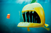
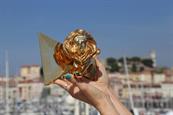
The brand bursts, which take the form of vignettes, will replace the traditional use of a brand logo, but still act as continuity devices. They were commissioned from several designers and directors, and are meant to act as branded content in their own right as well as representing the values of the channel, according to Nol Davis, head of creative at Five.
In a break with convention, they will start rather than end with the channel's logo and go straight into the next programme in the schedule.
The content bursts, meanwhile, are 10-second stings, updated on an ongoing basis, that are editorially related to TV shows but do not necessarily use content from them. Rather than being used as simply navigational tools or mini-promos for programmes, they will
reflect 'insight, comment or a witty moment' from Five's schedule.
The refresh was overseen by Carl Ratcliff, controller of marketing at Five, and comes ahead of the arrival of executive chairman Dawn Airey next month.


_1.jpg)
.jpg)
