


The revamp comes as the brand prepares itself for competition, following European Union liberalisation of the high-speed rail route between London and the Continent.
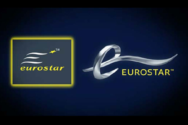
The cross-Channel rail operator is replacing its 15-year-old logo, featuring three stripes and a star, with one that uses a metallic-coloured lower-case 'e'.
The branding, by design agency Someone, retains the use of yellow text against a blue background. However, the word Eurostar has been changed from lower to upper case letters.
Eurostar is also revamping its website as part of the activity, with the site going live on 5 April. The overhauled identity will be rolled out at Eurostar's terminal at St Pancras International Station this week.
Nick Mercer, commercial director, Eurostar, said that the brand is looking to operate in a 'different, competitive, context', which he hopes will be 'brought alive' via the fresh identity as the firm prepares to extend its geographical footprint.
.jpg)


.jpg)