


This year’s book, the 54th edition, has been produced as a paperback – controversially breaking rank with the previous 53.
Why? Well, the cover itself gives us some clues. There’s the simple, line-work image that, at first glance, seems to be a nod to the iconic D&AD hexagon but, on further inspection, is also a cube emblazoned with the words "win one teach one". Then there’s the fact that the colour plates have been deliberately printed out of registration. Finally, probably the most leaden clue is found in the top left-hand corner. The D&AD Annual has been renamed the D&AD Manual (are you cringing too?).
It is clear the intention is that this year’s annual should not be treated preciously. It exists to be used, picked up and endlessly thumbed. It is being repositioned as a learning tool. Presumably this is an attempt to challenge the annual’s increasing irrelevance as an unopened, dust-gathering artefact huddled among its peers on the bookshelves of creative people the world over.
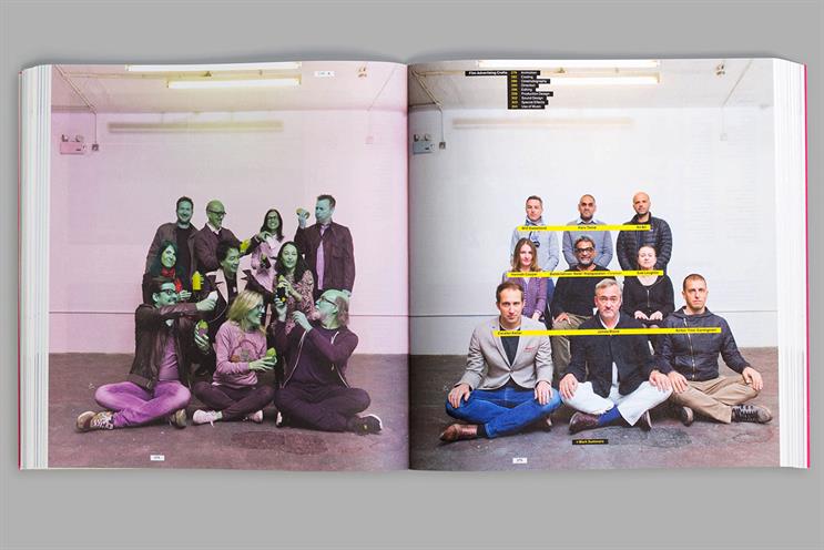
 And the educational theme continues throughout the book. The font is FF Schulbuch Nord. Schulbuch means "schoolbook" in German and it is based on the letterforms found in children’s textbooks. The annual also contains exercises that actively encourage you to write and scribble on the pages and the jury pictures take on the style of school photos.
It is all very well-intended and thought through but, for me at least, the execution does not live up to the intention. While "win one teach one" is a catchy phrase, it is based on the premise that if you can win a D&AD Pencil, you know how to teach someone else how to win one. That’s misplaced. Being able to teach is a gift and talent in itself, not a default consequence of knowledge.
The exercises feel like they are there because it’s supposed to be a book about learning. Not because they will be useful learning tools and, conceptually, they’re thinner than the emaciated paper on which they are printed. Also, should a font really be chosen because of its name rather than its design integrity?
If I were being generous, I would describe this year’s D&AD Annual as a valiant attempt at giving the book some much-needed relevance. If being critical, I’d say its educational ambitions are, at best, gimmicky and, at worst, disingenuous – driven by an editorial theme and cost efficiency rather than a deeply held purpose.
Whether you are a student or an executive creative director, it’s difficult to accept this book as a learning tool when it is priced at £70. A fact made even harder to swallow when you consider that its wafer-thin stock and flimsy cover make it nearly a kilo lighter than previous editions and, presumably, considerably less expensive to produce (and post) . Could do better.
Justin Tindall is the chief creative officer at M&C Saatchi