


This is the commentary of the greatest moment in English sport – England playing Germany in the 1966 World Cup final. Geoff Hurst is about to score his third, and England’s fourth, goal: "Here’s Hurst, he might make it three. He has! He has… so that’s it."
Not quite how you remembered it? Well, that was the commentary of Hugh Johns, the voice of the final on ITV.
 The one that is still played over and over again, nearly 50 years later, is this one from the BBC – the one you all know, by the great Kenneth Wolstenholme: "Some people are on the pitch. They think it’s all over… it is now!"
Those few words are as synonymous with that final as England’s victory. It also cemented Wolstenholme’s fame for evermore.
One of the worst things any of us can do is produce ideas that aren’t remembered. This year is the 53rd edition of the D&AD Annual. So is it going to be more Johns or more Wolstenholme?
D&AD has chosen one of the greatest designers of the past few years, David Pearson, alongside Alistair Hall and Paul Finn, to design the latest Annual.
Most of us would give our firstborn to get into its pages. But here’s the rub. We want in on one hand but, on the other, we can’t help but give it a good kicking.
 We moan if we’re not in, we moan if we get in, we moan if we don’t get a Pencil, we moan if we get a Pencil but not one of the right colour, and we moan even more about who or what does get in.
Over the years, the main target of people’s ire – probably because it can’t talk back – is the book itself. So spare a thought for Pearson, who has had this dubious honour bestowed on him.
He also has to tread where 52 have gone before with an almost identical brief and yet it still needs to stand out.
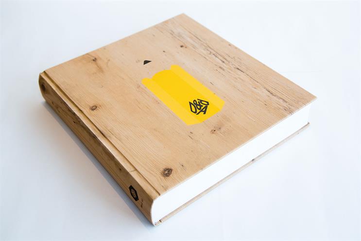
 The wood cover is beautifully printed and a nice nod to the new Pencils. And doing five covers enhances the idea.
But would it not have been better to have made it out of real wood, especially as only 3,000 are being made? Maybe the D&AD coffers were running a little dry.
The detailing of the Pencil graphic is well-rendered. As a package, it feels good in the hand and the page layout is clean and lets the work sing. Yet is it going to be up there as one of the greats? One that will be talked about like the 1985 "bible" cover?
That cover had a wonderful idea that, in an understated way, expressed everything that D&AD stood for and the importance of being within its pages. The craft of the type, embossed in gold, and even the hue and texture of the cover itself, were spot-on.
 This year’s idea is good. The craft is great and will rightly be talked about by all the print geeks out there. It ticks a lot of boxes. But it lacks something important: it lacks emotion. It doesn’t feel as important as it should because it doesn’t connect with our heart. We’re not sure people will covet it like they have some of the best.
But D&AD has never been about the cover. It is about what lies within. These are the things that stay with us. And if the design of the Annual stays with us as well, that is a bonus.
So, is this Annual Johns or Wolstenholme? For us, it’s a bit more Johns.
Adrian Rossi and Alex Grieve are the executive creative directors at Abbott Mead Vickers BBDO