


Years ago, with the advent of so-called desktop publishing (DTP), followed by the Mac, we saw what some commentators called the "democratisation" of type.
Nonsense. In fact, we witnessed plummeting standards in what had been a vital and worthy craft. And thanks to the internet, everyone now has a knowledge of typefaces: it begins and ends with Arial.
Of course, there are still art directors, designers and typographers who care. But they’re a rare breed – and do their colleagues (let alone clients) care as much?
As a copywriter, I’ve always taken a close interest in how the words I produce will appear. Nerdy or just plain professionalism?
Either way, the new campaign from the Science Museum hit me. Hit me like my morning quadruple espresso. In the usual sea of indifferent posters from the leisure industry that wallpaper London’s transport system, this work stood head and shoulders above the rest.
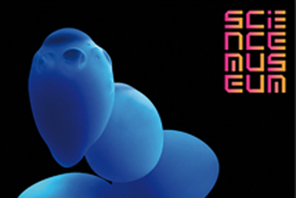
And much, if not most, of the credit can go to the beautifully designed typeface. Distinctive, but legible. Modern, but not faddish.
While everyone else is still apparently wedded to Helvetica Neue, the Science Museum has decided to be bold and create a face it can own. When I first saw the new identity, I didn’t know which agency was behind it, but it came as no surprise that it’s Johnson Banks.
Quoted in Creative Review, Michael Johnson points out: "In identity terms, the museum has lagged behind its London competitors. They had a simple wordmark and crest in the ‘80s that was slowly replaced by the ‘Sci M' device. This was dropped a decade ago in favour of a simple typographic solution; but this had struggled for recognition, especially in the competitive environment of cultural posters on London's Underground."
Quite so, Michael. But while I love the Johnson Banks solution, in the corner of our village known as "design", the identity has polarised opinion, as comments on a Creative Review blog reveal.
Maybe the "i" and "e" ligature is forced to make the words work as a block – I really don’t mind, as it gives another layer of interest to the piece.
And yes, some of the photography is a bit "stock library". But it’s early days for the rebrand, and, overall, you have to congratulate a large institution for a brave move.
We’re told that pre-campaign research revealed the new identity was "de-coded" in different ways by consumers. This variety and depth of engagement bodes well for the Science Museum’s future success in an increasingly tough market.
Simon S Kershaw is a creative consultant and a former creative director at Craik Jones.