


Damon Collins, founder, Joint, on…
Andy Jex, chief creative officer, TBWA\London, and Rob Potts, former executive creative director, Saatchi & Saatchi London
As a student, your portfolio is an ad for you. In subtle and not so subtle ways, a book tells those looking through it a huge amount about those responsible for the ideas within it.
Things like: the freshness of their creative thinking. The depth of their strategic thinking. How much research they put in. Their grasp of language. Their visual sophistication. The amount of work they are willing to put in. Whether they care about detail or not. And generally how smart they are.

One of the scariest things about putting a student book together is this: there’s no excuse for having a bad piece of work in there.
You have none of the usual rules and regulations to abide by. There are no budget constraints. You can feature anyone or anything without needing permission. And you can take as much time as you need to get it right.
All of which means that, when you look through a student book, it’s fair to presume the work is the best the team could do. So I will assume the work in this book is the way it is by design, not accident.
After flicking through this team’s portfolio the first thing I noticed was that no facts have been used anywhere. (Other than ABV percentages.)

I came away having learned nothing new. And was given no real reason to buy any of the products.
Instead of focusing on producing clever ideas, based on insight and information, this team has attempted to rely, almost solely, on humour to surprise and delight. Which is a totally valid, if rather vacuous, strategy. And a risky one.
If you’re going to try to laugh people into buying your product, your gags need to be really, really funny. And while this team undoubtedly has a good sense of humour, at the time this book was created, it may not have reached its hilarious heights.
Notably, two out of eight campaigns in this book are for alcohol. One brand claims to get you very drunk, the other claims to get you slightly drunk. Of those two creative platforms, the latter feels fresher.
"A little taste of Friday night" is a clever way of talking about a low-alcohol product. It’s a good campaign idea and one that could undoubtedly lead to some very funny work.
In the end, it can take only one good campaign, or even one good ad, to be asked in for a chat. And I would have got these guys in because of Gola.

They neatly brought to life a truth that’s a great way to steal share from Nike and Adidas: no football boot, no matter how expensive and technologically advanced, can make you a great footballer.
As every Brazilian beach-footballer turned pro has taught us: "Good feet can play in anything." So, if you really are good, save your money and buy Gola. A nice line based on a good insight. And the TV execution featuring someone playing keepy-uppy with a pint glass (alcohol again!) could be a great execution in real life. Clever, without trying too hard to be funny.
So what might I have learned about this team from their work? If I were a betting man, I’d say they like a good drink, like a good laugh and, most probably, like football. They also undoubtedly have potential.
If, on meeting them, they turned out to be nice, I’d have asked them to go away and come back with plenty of stuff as good, if not better, than Gola. And if they did, I’d have got them in like a shot.
Trevor Robinson, executive creative director, Quiet Storm, on…
Stu Outhwaite-Noel and Ben Middleton, chief creative officers, Creature
Looking through the portfolio, I wouldn’t say I’d have been overly impressed if I had been shown this book early in their career. I like quite a few of the campaigns, but there isn’t one that makes me feel: "Oh god, I wish I’d done that." Probably the closest to that feeling is the paper idea for Interflora. I like the fact it’s something tangible that you can hold in your hand that will just make you smile.

I also quite liked the Raleigh idea because it really reminded me of when I was a kid playing in the house, and all the damage we used to cause. I feel like the art direction and the thought could have been a bit stronger, and the third execution was definitely the weakest of the three because it just feels a bit more contrived. But, overall, this idea has legs.
I definitely would have given these guys a placement, as you can see their thinking. But a lot of the time, it looks like they’re doing ads for ad people, and that’s something someone also said to us years ago. Take the Little Chef one, for example – I just don’t believe it. It kept throwing me, and I kept asking myself: "Do people die while eating?" I’ve never heard of anyone eating a packet of crisps while driving, and dying.

But then the KFC one is really fresh. It feels like a funny thing to do, that’ll produce a popular execution, but is also an unpopular concept that will get people talking. It’s quite silly, but I think they could have taken the idea further, and that feels like the case with some of the other executions as well. When you see the first one, you think "Wow, that’s brilliant" but then it just gets weaker and weaker.
You can see that they can definitely art direct and illustrate, but you can also tell they’re not thinking: "We’ve got to make this look good because we don’t have much of an idea here."
Having said that, though, the First Direct one annoyed me typographically at first because I couldn’t read it at all initially. It was only by looking at the second execution that I finally understood the idea, which I’d rate a five out of 10 overall.

There are some great ideas here but then there are some awful and boring ones as well, and that’s why I probably wouldn’t have given them a job outright.
It obviously feels like they don’t know what’s a good ad and a bad ad in their own portfolio, but then having said that, it looks like they knew the ones they enjoyed doing.
That’s why my advice would have been: get rid of all the rubbish campaigns in the book and try to get in some fresh ones that are up to the standard of the good ones already in there.
For me, it’s obvious which ones they had the most fun doing, and that makes the work a lot stronger. That’s also why I would’ve expected them to do well because they had that good quirky side to them but they also knew how to do ads for ad people, which a lot of creative directors love.
Andy Jex, chief creative officer, TBWA\London, on…
Trevor Robinson, executive creative director, Quiet Storm
The perfect time capsule of advertising – a student portfolio. A reflection of the time. Indicative of the trends and the way we worked. A mirror of agencies and the talent in them. While students may not have the amazing work in their books that defined an era. What they do have is a style reflective of it.
This book reflects its era well and, at a guess, I reckon that era to be the late 1980s. There are a few giveaways – ads for a magazine, for one. Also an employment agency (Ecco), an Aids centre and even an ad to reduce the gay age of consent down from 21.
Being staunchly press, poster and TV, gives us a clue to its age, too. Noticeable by their absence are also the late-90s favourites – ambient and guerrilla.
But my guess is largely based on its style and inspiration. The advertising earthquake that was HHCL clearly hadn’t shaken things up when this student was putting their book together. The work follows a type – that set out by the smart writing and big, bold visuals from the genius of agencies like GGT, BMP and CDP.

The construct of the Geoff Capes Marmite script makes my point. It’s hard to believe there was a time before "Love it or hate it" even existed but, even so, the anarchic subversiveness that so influenced student books after HHCL isn’t in evidence here. The most subversive we get are the student stalwarts animal sex and drug use (Business magazine).

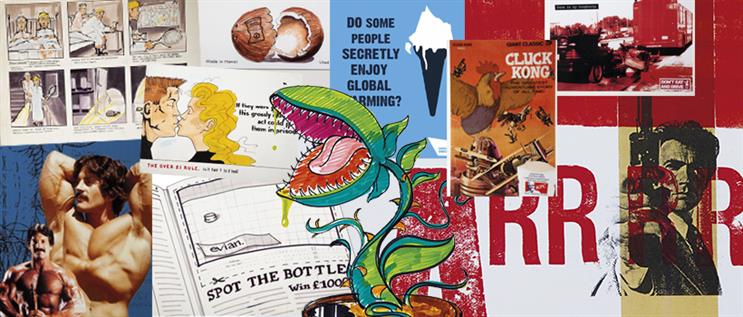
I like lots in this book. I love Evian – simple, bold, memorable, iconic – like Absolut and Silk Cut in its day. Newburgh Street creates a daft but bold simple visual that imprints it in my mind as a place for edgy streetwear. The lines for Lighthouse – the Aids centre – play wonderfully well against the day’s convention of charity work at that time, which was all way too much shock and horror.
The book leans quite hard on art direction. Ideas like Madame Tussauds are visual without a bigger thought. However, I do believe that the creator has inadvertently invented the selfie here.

And there are a few too many one-offs for my liking – Over 21 Rule, Marmite. Two of the ideas have only two executions (Delsey and Business). Funnily enough, we’re in an era now where tactics, one-offs and PR ideas are all the rage. So perhaps this book is more modern than it looks.
Rather than hand out a placement straight away, I’d make this person come back a bit and work for it. I’d need to see some more campaign-able ideas and more brand thinking. With bigger thoughts fleshed out across different media. I’d want to see some more of their personality. More breaking of the formats and challenging the way ads are constructed. Harsh I know, but this person can take it, they’ve done alright for themselves I reckon.
But a really great student book shouldn’t be reflective of its era, it should be a flag-bearer for the future. An unpolished sparkle of magic yet to come. A really great student book is a rare thing that will actually look out of place for its time. Perhaps a bit awkward or uncomfortable and definitely all too easy for a creative director to dismiss.
Fortune favours the brave in this case and there’s nothing quite like the feeling of making a young hire on a hunch, never really knowing whether they’ll fly or die, but definitely knowing it’s one of the best parts of the job.
Billy Faithfull, chief creative officer, Engine, on…
Anna Arnell, creative partner, And Rising
This is an ideas business, but you never hire on the ideas alone. Which is why I’ve never hired anyone from a meeting room. The King’s Arms is my interview room. We are creatives. High EQ, gut-feelers. I need to judge the energy as well as the ideas. Having said that, this is a good, and occasionally great book. I definitely saw it back in the day (I’m guessing 2009 from the Jedward reference), but I can’t quite put a face to it. So, off we go to London’s best-worst pub, anonymity intact.

Kinder. "Eat them before they hatch" is ace. It’s the campaign that jogs my memory. Often the work we are jealous of, the golds and titaniums, can be summed up with "… like a student idea". This is a lesson for strategists. Sometimes the best strategies are not data-led insights, but guesswork. And that is what fresh creative blood does best. It’s a cruel business that judges you on one skill (planning) to hire you for another (creative). It’s really dumb, a little edgy. Right up my strasse. As is another frosty, if poorly kept, pint.
Discovery. Classical idea, classical execution. Visual treats that would have seemed fresher in 2009. Noma Bar eat your heart out. But, and this may be the Kronenbourg talking, it’s the sort of stuff you do when you know you haven’t really cracked it.

NatWest. OK, this is where it starts to get interesting. In a world before Monzo and Yolt, before fin-tech was even a thing, this would have been fresh. I exclaim: "Why the hell don’t banks do this?" as I make my way through a second bag of pickled onion Monster Munch. It’s a different kind of creativity but creativity all the same. Experience design in bed with advertising. I raise my filthy glass.
The creative minds that put this work together are at home in a more connected world. But I’ve always been a bit wary of the tech first, idea second approach, so I’m missing a big thought in Ford Ka. It’s fine, but what would you do with the whole Ford brand? That’s where the big bucks are. A bit meh, but these continental lagers are not going to drink themselves and I’ve got a bag of roasted nuts, and I’m feeling generous.

Generous and contradictory, it turns out. I love "data donuts" for Krispy Kreme. No wildly simple, big thought here, but in 2009 if you’re folding data into humour, you’re doing something right. This is combining the silliness of the Kinder campaign with the technical nous of NatWest. Let’s move this outside. And can I pinch a roll-up? No, I can roll it myself, thanks.
As a wannabe creative, you’re expected to be a strategist (delivering human insight), a creative (telling unique stories) and a suit (selling your work with confidence and aplomb). This is why creatives are some of the most resilient people you’ll meet in the business. They are born curious and never lose it. I hate the phrase "traditional creative team". Real creatives can do anything, you just have to ask them the right questions.
My hunch is, these guys are the real deal. These days, books are full of actions, rather than ideas. You need both, so I’d hope these guys expanded their storytelling, narrative side a little and are now running a shop with a rich and varied output. If this is where you were in 2009, I’d love to see where you’re at now. Maybe I have.
Stu Outhwaite-Noel, chief creative officer, Creature, on…
Simon Poett, executive creative director, The Brooklyn Brothers
This isn’t fair on anyone. I’ve been given a design student’s book. Notoriously the most impenetrable and self-indulgent of all the portfolios. Even worse, this is full of those dreaded "working out" pages. Pages that reveal a knotted mind attempting to put the world to rights with a fine liner.
±±ľ©Čüłµpk10 has asked me to not spend too much time describing the ideas here: well, thank god for that. I need Rorschach levels of perceptiveness to interpret and make sense of the visual ramblings. That said, with consideration to the page full of vaginas three pages in, I may be better off calling on Freud. But alas, I have but my ad-traditionalist view on the world to wield.

The truth is, when faced with books like this – and the precocious soul who’s tortured themselves creating it – I tend to just waffle on at them about the need for ideas to communicate all by themselves. After all, we can’t sit on 100,000 coffee tables up and down the country explaining the ad’s "deeper meaning". I’ll attempt to describe the difference between advertising and design – communication versus expression, persuasion versus allurement. And then go on to talk about the strategic and conceptual skills I look for within a portfolio. All basically a tap-dancing ruse to avoid me having to critique the squiggles on show. But in this case they’ve given me a "get out of jail" card…
Paper-clipped, masking-taped AND Sellotaped to the back page is a quote from a psychologist: "There is a deep question, whether the possible meanings that emerge from an effort to explain the experience of art may not mask the real meanings of a work of art." The little bugger’s only gone and channelled their inner Joey Barton and, in effect, said: "Buggered if I’m going to tell you what those previous pages mean, because, well, ART YEAH."

Smart, facetious oik. Hang on, this is Nils Leonard, isn’t it? We haven’t been told who’ve we got and I’ve just worked it out. I’m going to put my house on it. If I’m wrong… well, take the compliment, yeah.
We have, though, been told to talk about the prospects of the person behind the book, so this gets easier if I’m going to go with my hunch. If nothing more, it’s revealed the kind of person capable of rising from their own self-ignited ashes. For, putting aside those pesky concerns about conceptual clarity, there’s clearly an excitable, fidgety and scrutinising soul on show. A soul that should follow their clear passions and go explore the world of design – perhaps more specifically typography – before flagellating themselves at the altar of advertising.

But if they really care what I think, well I generally look for big, rich or long ideas in student portfolios. Ideas that make me reappraise a brand and build a rich, creative platform from which years and years worth of ingenious execution can spring. This is the gold that only a handful of students each year truly mine and thus stand out from the crowd as a result. If they did fancy giving advertising a shot, I’d suggest they channel their visual excitement into emotionally engaging with people through insight and work up a book that speaks for itself.
Or bollocks to all of that, just dive into the design world and sneak up on advertising in a few years’ time wielding that fidgety fine liner – whatever, I’ve got a suspicion you’re about to have fun.
Anna Arnell, creative partner, And Rising, on…
Damon Collins, founder, Joint
This book is surprisingly refreshing, considering it’s from a pre-internet era. Students today are under pressure to go out and shoot their ideas, go viral, get in the news, and Photoshop their books, whether they have the technical skills or not.
This book doesn’t pander to any of today’s ideal beauty standards for a student portfolio. There’s not a case study to be found. Not a microsite in sight. #HashtagsNotInventedYet. Just creative thinking. The DNA of an idea stripped back and held together with ink from a Pentel N50. Wonderful.
The first campaign for a fly-trap brand is simple, and clearly ahead of its time with the "Catches them, kills them" tagline, if you remember the swine flu posters of 2009 (wow – remember when our biggest worry was dying of swine flu?). The layouts are clear and communicate the product benefit in a lateral way, leaving the viewer to close the circle. This is a recurring style of thinking throughout the book as seen in the next campaign for Big Man Clothes. The "small" headline with the XL shirt made me laugh.

Balans is next. What the hell is this? Is it gym equipment? Is it an interactive sculpture? Is it a sex toy for bendy people? No… it’s none of those. It’s a CHAIR you kneel on. My one criticism of this campaign isn’t the actual idea. It’s the choice of brand. When looking through a book if creatives can crack something that’s big and generic and difficult, like bread, or a bank, or a car, then it’s plus points. I would tell this student to lose the kneel-y chair.
The Hawaiian Tropic ad is too boys club for me. Busting nuts was probably encouraged by the very male creative departments back in the day. Even when I started out in the industry a decade ago I felt excluded from the boys. One big agency even shut me in a tiny yellow shed to work. Look around your agency right now and ask yourself: has it changed?

The Kryptonite campaign juxtaposes big images with a small but strong lock. We, creative people, love juxtaposition. I was going to suggest a more imaginative endline than "The strongest lock in the world"? But no – 2019 is endline HELL. Nouns are now verbs. My morning cornflakes must empower me to be a better human. My mouthwash wants me to tell my gum stories. Failing that, it’s just ‘"LOVE SOMETHING, LOVE BRAND NAME." Argh. This endline is bullshit-free.
The anti-slavery campaign changed the tone of the book which is important. Creatives have styles, but it’s important not to get pigeon-holed. And I would love to see the Trill birdseed ad made for real. It’s classic Tom & Jerry-style storytelling. The tone of this TV ad suggests this creative has a dry, slightly dark sense of humour which I love.

Immac was another visual treat – simple and clear product benefit, while raising a smile inside the mind of the viewer. And a condom campaign – a rite of passage for any student. I love the way the product is front and centre of this student’s whole portfolio. They clearly love advertising.
This book screams Watford to me. Simple. Emotional benefit. Product benefit. Lateral. I still hear Tony Cullingham repeating these words in my sleep. Sadly, when I left Watford, I felt the need to Photoshop images within an inch of their pixels. And it looked bad. Our industry would benefit from students having the confidence to strip back their ideas instead of feeling pressured to execute them.
Simon Poett, executive creative director, The Brooklyn Brothers, on…
Billy Faithfull, chief creative officer, Engine, and Ross Neil, deputy executive creative director, VCCP Blue
Wow, a book of ads. That’s made me think, "there’s not a single ‘ad’ in my book". Maybe I misinterpreted the brief. My journey into this world wasn’t through advertising, so I’m in awe of and slightly intimidated by someone who has a portfolio like this.
I can see the craftsmanship and attention to detail that has gone into this work. My own work has focused more on drawing how I wanted to feel or how I wanted someone to feel, to evoke an emotional response or create a stronger connection with people through my work. I guess this mindset that was instilled in my formative years has been carried through with me over time. I do feel it would have still applied if I’d taken an alternative path.
Would I have given this person a placement or a job? This is perilous, isn’t it? Hmm. Deep breath, pause for thought. In the "advertising department", in my previous agency, definitely yes. But today I’m looking for something different from candidates, probably because the world has changed significantly since this book was created, and now attention is much harder to earn than in the past.
I would be looking for something more in tune with broader culture, a greater curiosity for uncovering where people’s deeper connections exist.

"Good Coke, bad Coke" – that’s funny, isn’t it? Pertinent and topical. I liked that, like if Jake and Dinos Chapman had been handed the reins to one of the biggest accounts in the world.
"York Fitness: prison chic", that’s great. Certainly unexpected. I like it when I see broader "culture" brought into the mix. That’s where I begin to feel more invested.

Books that are just about "advertising", or subverting it because it can, I’m not that interested in. It’s just a joke for "us" isn’t it, really? Showing off to my mates.
It’s harder, I suppose, to be that worldly at the beginning, but that’s the challenge now. It’s not enough to just be technically proficient, to understand the industry. It’s now inherently important to think about what it means to people. To make them care.
Consider an ad being your output, rather than your starting point. It’s not necessarily wrong to start there, with an ad format, but I think if you start somewhere else, more interesting things can come.
Start in culture. This is really where people’s deeper emotional connections lie and where the greatest opportunity exists. This is where the creative process needs to begin, not end.

The space to reach an audience is more congested and competitive than ever. Anything you create has to rise above the noise and earn its place in culture. It’s important to be reflective about the work, and ask the question, "Does it earn the right to capture people’s attention?"
I would expect them to have gone on to do well. There feels like a single-minded focus on advertising in here, particularly the craft of it, and the construct of what makes an ad, so I’m sure success followed.
However, having an approach that is more focused on creating something that lives in culture, where people’s connections are so strongly ingrained, rather than just creating an ad, certainly questions whether the traditional approach is still the most effective way of connecting with people.