


How things change. Not so long ago, brands were rushing to replace old visual identities with trendy, hard-edge designs, featuring minimalist, sans-serif, neo-grotesque typefaces. Think Audi. Think Rolling Stone. Think Burberry and YSL. But as brand refreshes just unveiled by Burger King and Pfizer demonstrate, something’s shifted – and it’s thanks to Covid-19.
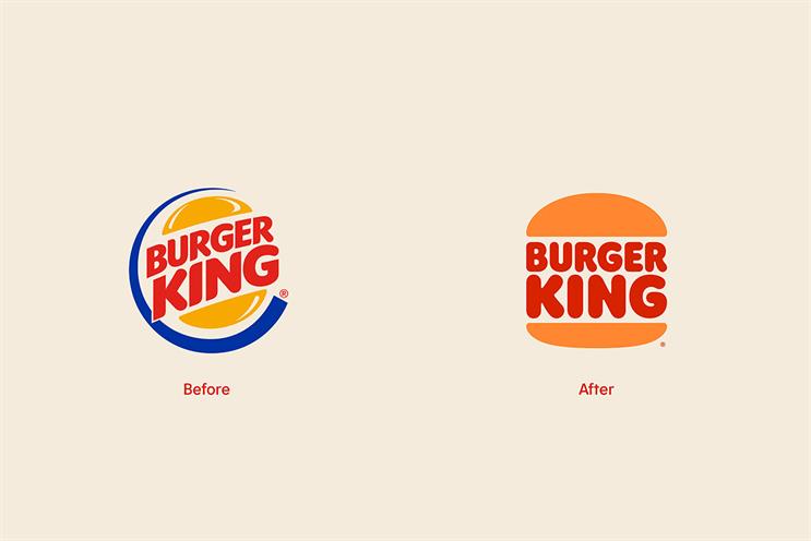
Take BK’s new identity [pictured, above] – its first complete rebrand in 20-plus years – featuring a brand new font inspired by the shape of its burgers and a rich colour palette chosen to better reflect the unapologetic boldness and irreverence of the brand. It’s fun. It’s warm. Tactile, even. But above all, it’s human.Â
Now let’s consider Pfizer, which after 70-plus years with its former identity has replaced its stark, pill-shaped lozenge with a two-tone blue, double-helix spiral to signify a shift – away from making pills to treat people and to curing and preventing diseases through breakthroughs that change patients’ lives.Â

Whether or not you feel the Pfizer redesign is as successful, it – just like BK – is attempting to better reflect a more human-centric approach through its brand design, too.
Looked at one way, this is a curious U-turn. Only yesterday, it seemed, brands were lining up to simplify and de-clutter in the name of chiselled edges. It was, they said, all about optimising for digital. In fact, Audi hailed its 2018 identity overhaul as being all about “accessibility for all” and being “digital-first”.Â
The subtext was that these new, streamlined visual identities were redesigned to be platform neutral. As a philosophy, there was – and is – nothing wrong in that. But then along came a global pandemic.
Lockdowns followed. Offices, hospitality and entertainment venues closed. High streets emptied. Where people could, they worked from home. All of which forced us to live most of our life – interacting with others and the world beyond our homes – by screen. And this led to two things.Â
First, brands that before Covid-19 could convey their brand personality and stories across an array of channels, platforms and contexts – in-store, on-pack, through real-world personal interactions or physical experiences like touch – had to rely on doing all this pretty much via just one thing: a screen.
Second, the importance of and value placed on screen-based people/brand interactions that were empathetic, authentic and, above all, human-centric soared. In the face of uncertain times, it wasn’t just people’s behaviours that changed – their priorities, wants and needs also shifted. In a world in which physical interaction was strictly curtailed, non-physical interaction with warmth and humanity was craved.Â
For, as people spent more and more time interacting via screens, something became apparent: while digital experiences had become the norm, many lacked soul.
For brands and marketing, the pressure is on to be more human: communicating more empathetically and innovating with new ideas that bring people together (albeit it remotely). Already we have seen many campaign examples of this. Now, we are seeing this filter through to visual identity design.Â
BK is a powerful example of the potential for a visual identity and its (pixel) space to be a spearhead for a brand story, rather than what it seems to have become for many in recent years: a punctuation dot at a brand story’s end. And it offers a route map for how brands can – and should – approach visual identity once the current crisis has ended in the post-Covid years that lie ahead.

Many of us are drawn more to brands that convince us they think and act human – and understand and respond to us as any decent human would do – ahead of brands that don’t. We have found ourselves drawn to such brands even more strongly during the pandemic, too. This is likely to continue in the future because it is, well, human nature.Â
Tomorrow’s winners, then, will be those brands best able to show empathy and humanity. This won’t just mean doing so via customer experiences or advertising, but also by visual identity in the physical and digital worlds.
Wayne Deakin is executive creative director, EMEA, at Huge