


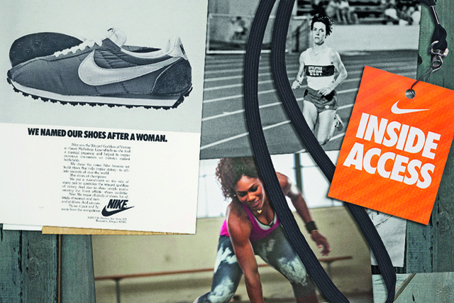
Nike has used many memorable copy lines over the course of its history, most famously "Just do it", but also "There is no finish line" and "Yesterday you said tomorrow".
In all that time, however, it has used only one logo. The Nike "swoosh" has become instantly recognisable across the globe and carries with it all the brand’s positive, life-affirming symbolism, as well as an acknowledgement of the Greek mythological roots of the Nike name.
Quite an achievement for what could just be seen as a simple tick.
In fact, the logo predates the company. Back in 1969, future Nike chief executive Phil Knight was working for an accountancy firm in Portland, Oregon.
As a business sideline he was importing Japanese running shoes and selling them for the company he’d co-founded with his former athletics coach, Bill Bowerman – Blue Ribbon Sports. While lecturing at Portland State University, Knight overheard graphic design student Carolyn Davidson tell a friend that she couldn’t afford to take a class in oil painting.
Knight offered her some work at $2 per hour, designing charts and graphics for his company. Two years later, Knight needed to differentiate a new batch of shoes and turned to Davidson for help.
He asked her to design a shoe stripe, with the brief to "make the stripe supportive of the shoe". What she came up with failed to impress.
In fact, it came down to choosing the option that was, as Knight put it, "the least awful". After settling on the swoosh, Knight declared: "I don’t love it, but it will probably grow on me."
The swoosh was first used by Nike on 18 June 1971 and registered as a trademark in January 1974. But although it has been around as long as the company, its use has evolved considerably. In its first iteration, which now looks rather ungainly, the word Nike – in a lower-case, white, italic font – was superimposed along the length of a white "tick".
It wasn’t until 1978, two years after Nike hired its first ad agency, John Brown and Partners, that the logo started to gain some coherence.
In this version, the word Nike, in Futura Condensed Extra Bold, was placed above the swoosh. In 1985, this same arrangement was used on a red background and finally in 1996, in recognition of its globe-straddling ubiquity, the swoosh was allowed to stand alone, the addition of the word "Nike" deemed superfluous.
 Product development and celebrity endorsement go to the heart of the company. From the outset, Bowerman displayed an insatiable appetite for tinkering, improving and reinventing the running shoe.
From the time it backed US runner Steve Prefontaine, Nike understood the power of a successful athlete’s endorsement.
These strands coalesced perfectly with Michael Jordan and Air Max, which put Nike back on top in the 80s, a position it has maintained ever since.
Theses have been written on the reasons for the success of the swoosh, but the fact that it was designed for a shoe, and has stayed there, probably explains it better than anything.
Did you know?
- Swoosh designer Carolyn Davidson charged her work out at $2 per hour in the late 1960s, finally submitting a bill for $35. Phil Knight later compensated her with a golden ring in the shape of the swoosh with an inlaid diamond and 500 shares of Nike stock, which she never sold. They are now worth about $500,000.
- Nike’s most dedicated employees are known as "Ekins" (Nike spelled backwards). Most of them have the Nike swoosh logo – sometimes in reverse – tattooed on some
part of their body. - The Nike employee store is called Swoosh.com and those fortunate enough to be able to shop there generally enjoy a 40% discount.
- The Nike swoosh is extremely similar to the logo used on Newport cigarette packets. This brand of menthol cigarettes was widely available in the US at the time the Nike logo was designed, but no copyright-infringement case has ever been launched by Newport’s parent company, Lorillard Tobacco.
- In 1996, Advertising Age named Nike its Marketer of the Year and declared that the swoosh was "more recognised and coveted by consumers than any other sports brand – arguably any brand".
Sector round-up
Adidas

Although the three stripes have remained constant throughout the German brand’s history, its logo has evolved in a bold and effective manner since founder Adi Dassler introduced it following the bitter split from his brother, Rudy in 1948.
It has undergone two major changes: the classic "trefoil" in 1972 was replaced in 1990 with the triangle which remains to this day. All three logos have been instantly recognisable.
Reebok
While the Bolton company’s logo remained virtually unchanged for the first 40 years of its existence, since 1996, it has been repeatedly altered, at times abandoning the name, at others amending it to Rbk and most recently ditching the "vector" logo completely and reverting to the full company name.
The changes are perhaps indicative of Reebok’s recent tribulations; in 2005 it became a subsidiary of Adidas.
Lacoste
The Lacoste crocodile logo was designed by Robert George for his friend René Lacoste when the  French tennis ace established his polo-shirt business in 1933.
In his playing days, Lacoste was nicknamed "The Crocodile" for his tenacity. His company displayed similar stubbornness in (successfully) fighting a 25-year legal case against a Hong Kong sportswear firm called Crocodile with a similar reptilian logo.
Puma
Even back in 1948, when the company bore the unwieldy title of PUMA AG Rudolf Dassler Sport, the logo of the leaping cat (initially jumping through a letter D) was present.
Since then, modifications have been made to make the puma’s movement more dynamic and the typeface more modern, but the original idea prevails.
Umbro
Umbro’s "double diamond" logo has graced some of the most famous shirts in football and has long  been synonymous with the sportswear company founded by brothers Harold and Wallace Humphreys in 1924.
The original logo comprised a single diamond and the company name. The current logo was in place more than a decade before an Umbro-clad Bobby Moore lifted the World Cup in 1966.