


It’s said great ideas acquire many fathers, and many claimed to have written the line "Labour isn’t working". But, actually, it was written by Andrew Rutherford. I know, because I was his art director and we worked as a team at Saatchi & Saatchi.
I had previously worked at DDB, where I had won a couple of D&AD silvers, and in 1976 I got a call from Jeremy Sinclair, Saatchis’ creative director. The agency was looking for an art director to work with Andrew, a prolific, award-winning copywriter – it was an easy decision.
A year later the country was in turmoil under a Labour government, with high unemployment and daily union strikes. There were rumours that before things got any worse the government might call an election – a year before it had to. To land a pre-emptive strike, the Conservative Party brought in Saatchis and briefed it, initially, to produce a series of posters.
The brief was one all political parties fall back on – don’t make any promises that you might not be able to keep. Instead, attack the opposition’s poor track record.
Most creative departments are pretty left-of-centre. But, like some others in our creative department, Andrew and I felt the need for change, so we took on the brief.
Andrew had a strong competitive streak, and the following Monday morning he came in with a raft of thoughts and lines he had worked on at the weekend. Among them was "Labour isn’t working".
I instantly liked it and initially drew it up as a realistic photo of a vast crowd queuing to get into a job centre with the headline underneath.
The high quality of the work consistently turned out by Saatchis was due to the fact that Charles Saatchi took a real, personal interest in what was allowed to go out of his agency. His first instinct when he saw the poster was "yes", but one sensed it was a bit of a half-hearted yes.
The account team loved the idea. But our poster sat in Charles’ office and we didn’t hear any more for a week or so. Eventually, Jeremy suggested that perhaps I should look at the layout again.
I had already had some further thoughts and I drew up the poster once more, this time filling the area with a big, long snaking queue heading towards, and under, a banner that read "Unemployment Office", all against a white background. I positioned the headline above the photo in one long line.
By spelling out "Unemployment" on the banner, the idea became quicker to understand.
I have always assumed that Charles then approved of it because it was finally presented to the Conservatives and they loved it. That said, it was reported back that Margaret Thatcher wasn’t sure about it, because she thought that by mentioning your opponents in the headline you were, in some way, promoting them.

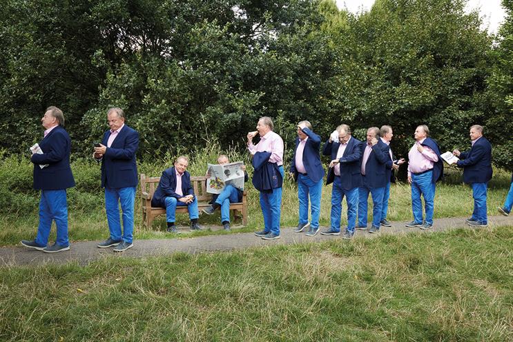
Conservative Central Office put us in touch with a local Conservative association in the Hendon area, which agreed to provide 100 to 150 people to be our queue of unemployed.
To make sure it was easy for everyone to attend, Bob Cramp, the photographer, got permission to shoot on an open grassy area of the Welsh Harp, near Hendon.
Three days before the shoot, we suddenly got the bad news that they would only be able to get 30 to 40 people to form our queue. Poster sites were already booked so we had to go ahead. But, as fate would have it, the problem became the making of the poster.
For image quality we had planned to shoot the entire queue on a 10 x 8 plate camera. So, in those pre-Apple Mac days, I came up with the idea of laying out a long length of rope in a snake-like shape right across the park area and photographing our 30 or so people at different points along it and stripping them together to form the queue.
Having purchased some rope from an ironmonger on Charlotte Street, I went into our studio to work out a shape for my queue. With the prospect of a thinner, smaller queue, the headline at the top of the poster looked unbalanced, so I split the headline over two lines and put it under our Grant Projector to enlarge it. Just like a photograph coming into focus, the poster suddenly took on a totally different persona.
By increasing the size of the headline, it instantly commanded more attention. The concept was the same but the dynamics had been reversed – it went from a big picture idea with a smaller headline to a big headline and small picture. But the end result was a more powerful visualisation of the whole idea.
The photo shoot and the final "strip up" went amazingly well and, as they say, the rest is history.
We suddenly got the bad news that they would only be able to get 30 to 40 people to form our queue
When it was launched, it caused an almighty stir, sparked by the then chancellor of the exchequer Denis Healey standing up in the House of Commons and attacking it as "soap powder advertising produced by Satchy & Satchy".
Immediately every newspaper put it on their front page, every TV station had it on the news, and the more Labour kept talking about it, the more coverage it received. By the end of the first week, both the poster and the name Saatchi & Saatchi were known in every household in Britain.
It won various accolades, and in 2000 was awarded the title of "Poster of the Century" by ±±ľ©Čüłµpk10, which was extremely generous, given it was up against Gilroy’s wonderful Guinness posters and the Lord Kitchener recruitment ad.
I recall that some time after the poster ran Charles popped into our office with a relative from New York and explained to him what we had done. Andrew laughingly brought up the subject of possible pay rises. Charles loved teasing Andrew and said: "Surely you want something more in life than just money?" Andrew quickly replied: "OK, your E-Type Jaguar."
Charles smiled, turned to me and asked what I would like. I replied that on the back staircase of the agency there was a print that was rarely seen by anyone, was totally unloved and in the corner it had a crack in the glass. It was an original print by Richard Hamilton called "Kent State".
A week later, I came into our office to find a very large parcel wrapped up, with a note to me that read: "Enjoy, Charles."
Martyn Walsh was an art director at Saatchi & Saatchi