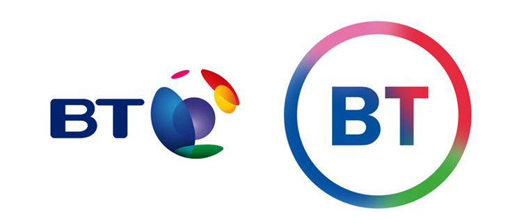
The telecoms company in September for the new logo, a circle with transitioning colours with BT in the middle in a simple sans-serif font.
While BT is yet to officially approve the new visual identity, the change looks set to go ahead next year, sources . A spokesman for the company would not comment on the plans, saying only that "we regularly register trademarks from across the business."
The logo would be only the fourth for BT since the company was privatised by Margaret Thatcher’s government in 1984. The original logo, a blue T in a circle designed to symbolise a telegraph pole, was replaced in 1991 by the blue and red Piper, at the same time the business changed its public name from British Telecom to BT.

That logo, intended to represent the empowerment of the consumer, drew derision from some for appearing to suggest the company "blowing its own trumpet".
The current logo, featuring a multicolored globe icon symbolising the "connected world", was introduced in 2003. But the new icon would make BT the latest in a line of brands to ditch skeuomorphic design, in which graphics are made to resemble 3D objects, in flavour of flat design that embraces the 2D nature of a screen.


As well as the logos used by brands including Netflix, PayPal and Microsoft, flat design has become increasingly dominant in websites, apps and operating systems. BT’s choice of a simple sans-serif font, meanwhile, makes it part of the same trend that influenced the new brand identities of Google and Airbnb.


James White, consultant at brand communications agency Vital Communications, said the move was "another example of a large corporate swapping its established logo design for something better suited to the mobile age.
"Bold and simple in its design, the new logo will work well across apps and social media. By retaining the colour palette of earlier logos, it will still be easily identifiable.
"BT is following in the footsteps of brands like Deliveroo and Uber, which have recently adopted more minimalistic logo designs that translate easily across channels.The logo redesign is also signalling more fundamental changes at BT; ahead of the planned overhaul of its business offerings."


.jpg)
.jpeg)
