


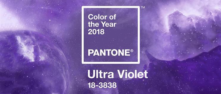

Goodbye Greenery, hello Ultra Violet - otherwise known as 18-3838. Pantone, the global colour institute, has announced its Colour of the Year and moved away from the natural shade of forest green opting instead for "a spiritual, cosmic hue" of purple.
Announcing the choice for Pantone’s Colour of the Year, Leatrice Eiseman, executive director of the Pantone Color Institute, said: "We are living in a time that requires inventiveness and imagination. It is this kind of creative inspiration that is indigenous to Pantone 18-3838 Ultra Violet, a blue-based purple that takes our awareness and potential to a higher level. From exploring new technologies and the greater galaxy, to artistic expression and spiritual reflection, intuitive Ultra Violet lights the way to what is yet to come."
Spiritual reflection aside, will brands succumb to the new purple reign of Pantone’s 19th successive Colour of the Year? Several partnerships have been secured, with Saatchi Art among the brands working with the colour institute to create a limited-edition collection of official Pantone Colour of the Year 2018 prints.
Adobe Stock, too, has been keen to champion the colour to the creative community, introducing a curated Colour of the Year 2018 collection among its visual assets. Butter London, the cosmetics brand, has also renewed its partnership with Pantone, joining forces to create an exclusive nail and beauty collection.
The Colour of the Year selection process involved colour experts at Pantone searching for colour influences worldwide, reviewing the entertainment industry, films in production, travelling art collections and upcoming artists, fashion, all areas of design, plus lifestyle trends and socio-economic conditions. Influences can also come from tech, materials, the launch of social-media platforms and even global sporting moments.
Pantone's hope is that designers and brands embrace the colour, from a product and campaign perspective. Michael Johnson, designer and founder of Johnson Banks, commented: "Adopting Ultra Violet as a lead colour would be a brave move for most brands – it’s unusual and triggers odd associations for some audiences. For years, presenting any scheme in any kind of purple got shot down immediately as being ‘too religious’. A certain type of person, probably male, will view Ultra Violet as ‘feminine’ – rightly or wrongly. But there are several schemes recently that have partnered these types of colours with mint greens and they look great. Who would have thought that mint green and light purple would be directional?"
Pantone's hope is that designers and brands embrace the colour, from a product and campaign perspective
For Jules Vizard, creative partner at St. Luke's the colour represents some very welcome qualities for 2018. "Ultra Violet has always been known as the colour that reveals things, whether it’s trying to pass off dodgy fivers in your local newsagent or your dandruff on the dance floor. Now, according to Pantone, it also reveals originality, ingenuity and visionary thinking – given the shambles of Brexit, Trump et cetera – qualities we all could definitely use more of in 2018.
"Are these colour predictions useful to brands? Well it’s pretty close to our client Littlewoods' brand colour so, if as Pantones hopes, consumers see it a colour of optimism that can only reflect well on the brand."
A colour-lead experience
Meanwhile, Pantone’s influence in the field of brand experience is rising in prominence – the colour institute is no stranger to experiential marketing, having introduced a pop-up during New York Fashion Week, where shoppers could bring colour in to their wardrobes.
At the start of 2017, to celebrate Greenery, Pantone’s colour of the year 2017, the brand teamed up with Airbnb to transform a London warehouse into a space for wellness. Visitors could make green gin, forage for herbs on the walls and drink tea made with leaves picked from a hydroponics installation.
This was followed by a dramatic tribute to fashion designer Richard Nicoll at London Fashion Week in February. For this, Pantone created a bespoke shade, Nicoll Blue, to be used to paint the main entrance to The Store Studios on the Strand – the central hub of LFW – to honour the designer.
Dominic Franks, director and co-founder of brand experience agency The Persuaders, said: "Ultra Violet is a really brave choice by Pantone. The 2017 colour, Greenery, was a kind of peppy forest green, and whilst it was used effectively by Airbnb at its event, I feel it didn’t hit the experiential brand world with much force, as green is essentially a very safe colour, as it has universal appeal. This bright purple on the other hand can be quite polarising, as it’s quite a dramatic colour.
"Insta-backgrounds, experiential spaces, carpet and lighting colours can all work powerfully to subconsciously elevate a brand to seem on-trend. This shade of purple also brings to mind the cosmos and space, a trend that is also predicted to be prevalent in 2018 and an easy win for experiential theming. It’s also gender neutral and a colour that works well with all skin types – two themes that will continue to have significance in 2018, which, experientially, means we can create environments that are attractive to a wider audience."
Hot Pickle’s co-founder, Patrick Hammond, believes that this year’s colour resonates on a few levels. "It’s not often found in the natural world, it feels futuristic and unreal. I think over the next year we will see the debate grow about the AI, something similarly futuristic. Is it a force for good to solve all our problems and ease our labours, or will it create misery?
The design verdict
"As a colour, It’s polarising. In a world of increasing political turmoil I think brands will continue to be challenged to figure out how to navigate hot-button issues, and many will likely take sides rather than try for a bland middle ground. Design-wise it harkens to nostalgia for the 1990s – loud, graphic and bold, all trends that are likely to continue."
McCann London’s design director, Lisa Carrana, finds it difficult to get past the Prince association. "Let’s face it, Prince owned the colour purple. He had a cheeky rebellious side, which was offset by his private demure, and that echoes exactly how I feel about the colour. Overall, Ultra Violet portrays optimism and depth, and when paired with other colours brings energy and richness to any medium.
"I see Pantone's announcement of Ultra Violet as colour of the year filtering down [to the] mainstream, so expect to see this shade in homes around the world and even on the high street. However, I’m not one for thinking brands should automatically piggyback a trend. If a brand really wants to kick it up a notch, perhaps someone like Cadbury, whose signature colour has always been purple, could tread the anti-trend path. Now that could be fun to see."
A brief history of purple Pantone