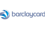
The financial services brand is also to phase out its Barclaycard Business brand as part of the shake-up.
The new symbol, created by design agency The Brand Union, aims to convey a calm, confident exterior while being warm and vibrant on the inside. It has been designed to work better online than the current branding and comes in four different colours - green, orange, magenta and the signature cyan version, to bring Barclaycard closer to the parent Barclays brand.
The new look will be rolled out internationally over the coming 12 months, although existing credit cards will be replaced as current stock runs out, meaning it will be 2011 before some cardholders receive cards with the new logo.
'Our new identity expresses where we see the future, freeing the chip on the credit card from the constraints of the plastic around it, making the way people pay for things simpler,' said Barclaycard chief executive Antony Jenkins.


_1.jpg)
.jpg)
