


“We might be changing out our K for a T, but what we aren't changing is this brand's commitment to making best-in-class vehicles for drivers and people everywhere.” That was the justification for Volkswagen changing its name to Voltswagen earlier this month.
Except it didn't. It was a (mistimed) April Fool’s joke. No one would change the spelling of their brand name, would they? And not to something so on-the-nose, something that so clearly tries to capitalise on a new trend.
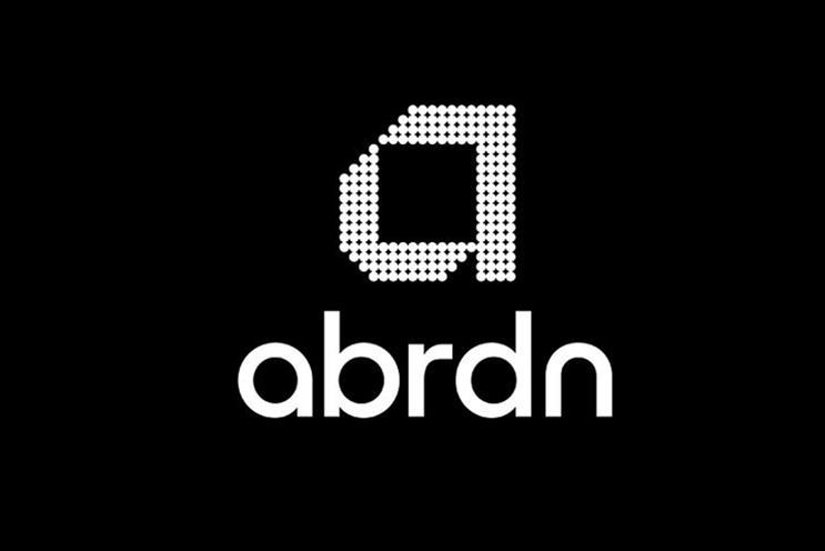
No one except Standard Life Aberdeen. Yesterday the investment company announced it was changing its brand name to Abrdn. Most human beings read that collection of consonants as “a burden” but, in fact, it is pronounced Aberdeen – as the firm was obliged to explain to the public.
There is a rationale. The Standard Life and Aberdeen Asset Management Company, which is actually based in Edinburgh, was formed in 2017. Earlier this year, the 196-year-old Standard Life name was sold off for £60m.
What remained was the fund management arm, known as Aberdeen Standard Investments; the financial-planning arm, named 1825; and the discretionary investment-management arm, known as Aberdeen Standard Capital.
It’s a lot of different names and a lot of different websites. Shares in the company are down 31%, so this is obviously a good time to replace all those names with one sort-of-new identity. The new-look group plans to focus on global asset management, technology platforms for UK financial advisers and UK savings and wealth. It all goes live in August under the banner Abrdn.
A good logo has a job to do. It must stand out from the competition but also look in-sector. It must be easy to find and easy to recall, especially among new customers, who have no idea who you are. They must make the customer feel something, but not too much.
It’s the spelling of Abrdn that is so hard to get over. While there is perhaps something admirably humble about omitting all capital letters (it is stylised as "abrdn"), scrapping most of the vowels too seems bonkers. Looking good on TikTok is one thing, being impossible to pronounce is another.
Design agency Wolff Olins, which is behind the rebrand, has also taken the unusual step of "sanding off" the "a" and "n" in the wordmark, effectively removing the upstroke at the top of these two characters. This makes all the letters look like the letter O.
Clearly the goal is to look digitally enabled. But Abrdn is a B2B bank, so any new customers are likely to be middle-aged investment pros rather than fans of TikTok. Cstmrs my wnt thr vwls bck.
Still, once you get past the name – which, I have to believe, is having the e’s forcibly stuffed back into it as we speak – the rest of the logo is not horrible.
According to Abrdn’s chief, Stephen Bird, his new logo makes Abrdn a “highly differentiated brand”. You and I might think it does not sound much like a bank at all, but then neither does challenger retail-bank-for-students Monzo. It does have vowels in it, though.
Andy Pemberton is the director of data visualisation agency Furthr
A designer’s thoughts on Abrdn
“Financial services companies need to be good on detail. Losing three vowels will not boost confidence in the brand,” Andy Cowles, creative director of design consultancy Cowles Media, points out.
“Black is certainly good enough for Apple, In print it can look domineering but, on an oblong screen, which emanates light rather than reflects it, it creates cut-through.”
Cowles says black also aligns Abrdn with monochromatic fashion brands such as Prada and Burberry. “It’s smooth, minimalist and modern, if a bit emotionless,” he says.